

The 2026 Colors of the Year That Are Shaping Luxury Homes
Every year, Pantone’s Color of the Year sparks conversation, and 2026 is no different. With Cloud Dancer, a soft, airy white with a powdered pastel undertone, the brand chose a light, unobtrusive shade, seeking to set a restorative emotional tone.
However, Pantone is far from the only industry voice shaping how our homes will look and feel. Many paint brands and design-forward manufacturers release their own picks, often with a closer eye on how color actually lives on walls, cabinetry, and architectural details. For 2026, the message is clear: comfort matters, nature still leads, and restraint is having a moment.
Here’s how other major brands are interpreting the year ahead.
Silhouette by Benjamin Moore
Benjamin Moore’s Silhouette takes a stroll in the opposite direction from Pantone, delivering a deep, moody neutral that feels both classic and modern. Best described as a charcoal with warm undertones, it has enough softness to avoid feeling cold or industrial.

Photo: Benjamin Moore
“The connection between fashion and interiors has always been a source of inspiration but this year in particular, we’ve noticed a renewed interest in suiting and classic silhouettes, the resurgence of timeless pieces, and the growing interest in the brown color family,” says Andrea Magno, Benjamin Moore’s Director of Color Marketing & Design.
For homeowners who want drama without flash, Silhouette would be well-suited for libraries, dining rooms, or statement kitchens. It plays especially well with brass fixtures, creamy marble, and layered lighting.
Universal Khaki by Sherwin-Williams & HGTV Home
This warm, grounded neutral lands squarely in the “safe but stylish” category, which explains its wide appeal. Universal Khaki is earthy without being heavy, and neutral without being boring.
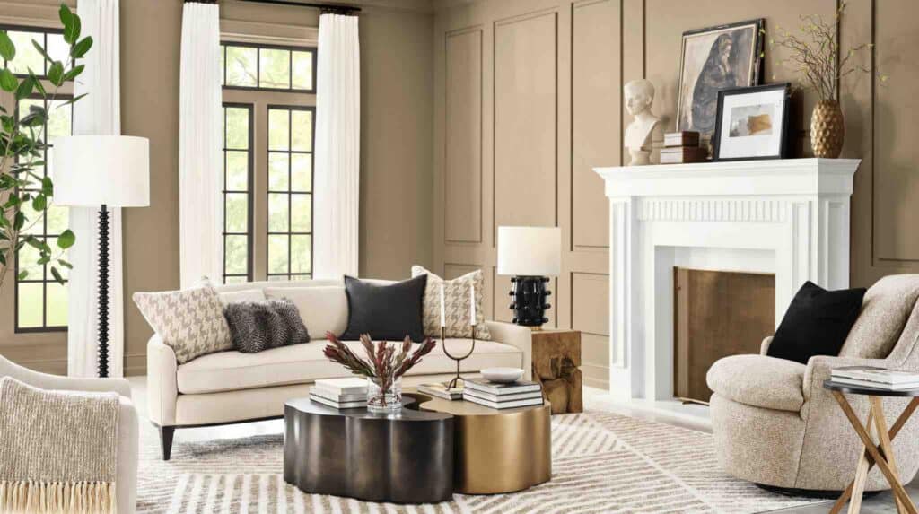
Photo: Sherwin-Williams
For real estate, this is a practical choice. Universal Khaki photographs well, adapts to many styles, and makes spaces feel finished without overwhelming them. In luxury settings, it works beautifully in open-plan homes, transitional spaces, and anywhere continuity matters.
Hidden Gem by Behr
Behr’s Hidden Gem adds a jolt of color to the 2026 lineup. Erika Woelfel, Behr’s Vice President of Color and Creative Services, states: “Now more than ever, there’s a growing appetite for colors that challenge convention and bring an unexpected sense of wonder to everyday spaces.” This rich blue-green delivers, leaning toward jewel-toned but with more depth and personality.
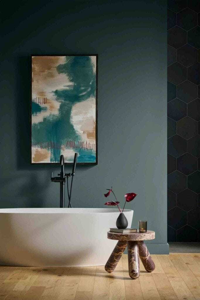
Photo: Behr
While not an all-over neutral, Hidden Gem shines in powder rooms, built-ins, and accent walls. It pairs nicely with natural stone, matte black hardware, and warm metals. It’s a reminder that even in a year focused on calm, there’s still room for bold, intentional color.
Warm Eucalyptus by Valspar
Warm Eucalyptus sits comfortably in today’s ongoing love affair with green, but with a softer, more livable twist. This muted green carries warmth, making it feel organic rather than sharp. It’s a fresh yet sophisticated hue that works with a surprising variety of color palettes.
It’s easy to imagine this shade in sunlit living rooms, bedrooms, or spa-like baths. For upscale homes, Warm Eucalyptus bridges indoor and outdoor living, reinforcing the connection to nature that continues to define luxury design.
Melodious Ivory by Dutch Boy Paints
Dutch Boy’s Melodious Ivory is a gentle, welcoming neutral with creamy warmth. Unlike cooler whites, it brings softness and ease to a space, making rooms feel lived-in yet polished.
This is a strong choice for homes that lean traditional, coastal, or transitional. It layers well with texture such as linen, plaster, or aged wood, and works beautifully in properties where warmth is part of the appeal.
Lisbeth Parada, Color Marketing Manager for Dutch Boy Paints, said, “Our 2026 Color of the Year invites homeowners to embrace what matters most — comfort, quality and connection. Melodious Ivory offers a classic backdrop that beautifully supports the textures, elements and personal touches that make a space truly feel like home.”
The Big Picture
Taken together, the 2026 Colors of the Year point toward balance. Whites are softer, neutrals are warmer, and bold colors are used with intention. For luxury real estate and design, that translates into homes that feel calm, enduring, and quietly confident, designed not just to impress, but to last.

![Indoor/outdoor living has evolved far beyond the patio or poolside seating area 🌿 Today’s most thoughtful homes are designed to blur the boundaries between inside and out, creating spaces that support everything from entertaining and wellness to everyday relaxation. With flexible layouts, durable materials, and a stronger connection to the landscape, the next generation of East End living is focused on how a home feels and functions throughout the year. [link in bio]](https://hamptonsrealestateshowcase.com/wp-content/uploads/sb-instagram-feed-images/710830844_18598759708030135_2167851243877024321_nfull.webp)
![A home should tell the story of the people who live there ✨ Designer @samtannehill of @tannehillinteriors believes the most successful spaces are the ones that feel warm, layered, and deeply personal. Through thoughtful materials, natural color palettes, and an emphasis on how families actually live, her Southampton home reflects a design philosophy rooted in comfort, function, and connection. The result is a timeless interpretation of Hamptons living that feels collected, lived-in, and effortlessly welcoming. [link in bio]](https://hamptonsrealestateshowcase.com/wp-content/uploads/sb-instagram-feed-images/708953286_18598495174030135_5355474848495384064_nfull.webp)