The Gold Coast town of Bellport, on the south shore of Long Island, has special significance for the designer Phillip Thomas. As a boy, he spent many happy summers there, and he counts the place as a formative influence. So when the parents of childhood friends asked him to do the interiors of their summer home in Bellport, a six-thousand-square-foot Shingle-style house they were gut renovating, he agreed without hesitation.
The house was in dire need of an update. At the same time, however, it held a lot of memories and was home to all manner of heirlooms which the clients wanted to be a part of the new design. The challenge, as Thomas saw it, was to reconceive those objects in a fresh and surprising way.
As admirers of Thomas’ work will tell you, he’s a dab hand at just that. A longtime collector of arts and crafts and contemporary art from Latin America with a focus on Chile, he’s sensitive to the personal meaning objects have for their owners. He himself is particularly drawn to pieces in which you can see, as he puts it, “the hand and the passion that created them.” But he also knows that even the most vibrant collection can lose its luster if it is left too long in one place. To keep things interesting, he makes it a practice to regularly rotate the art and objects on display, shifting their positions within a home, and setting them alongside new finds. A chest in the foyer, for example, might look altogether different in a bedroom while a mirror in the bedroom can take on new life in, say, a powder room.
He employed this strategy in the Bellport house where family antiques now happily co-exist with, well, even older antiques. Given the clients’ love of folk art, he decided to go full Americana. The double-height entry hall makes a dramatic impression thanks to a sculptural chandelier of Thomas’ design which incorporates spools recovered from an old lace mill. “It’s interesting when it’s illuminated and it’s interesting when it’s not,” he notes.
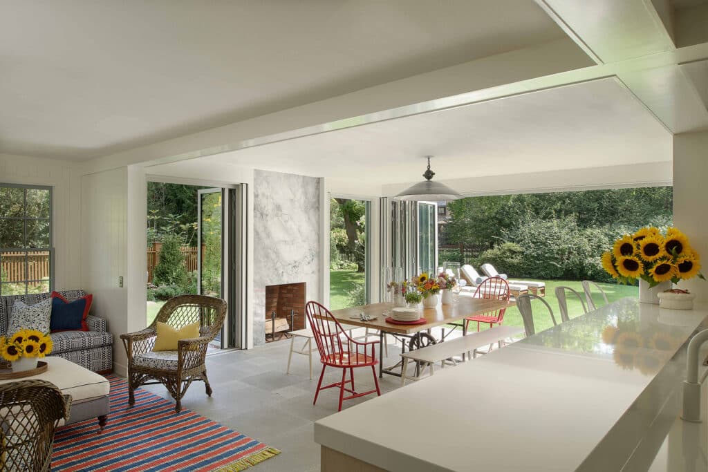
What’s also interesting is the interplay between interior and exterior spaces, which the new floor plan enhanced. A second dining room features a veritable wall of glass doors that open directly on to the pool area, “seamlessly integrating the inside and the outside,” says Thomas. The second floor master bedroom has leafy views of the lap pool and old-growth trees, which mean a lot to the clients, who are avid gardeners.
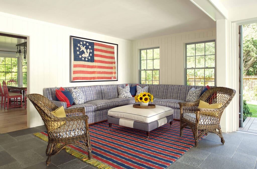
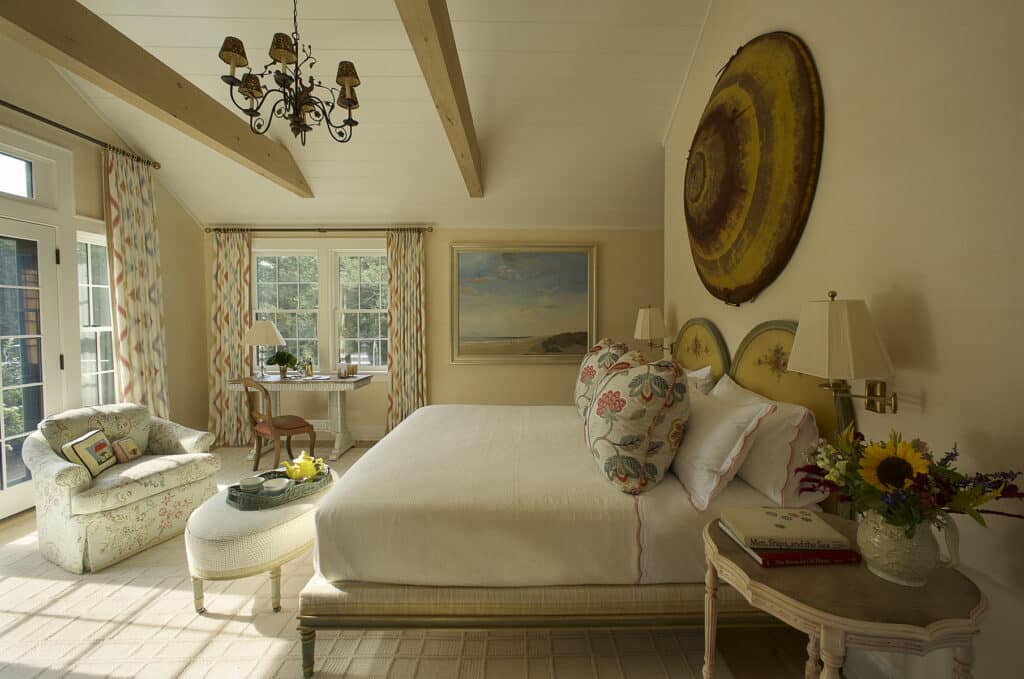
Other references which combine the clients’ love of the outdoors and the past are the tractor seats in the mud room, along with a museum-style vitrine where glass bottles that were excavated during the renovation are displayed. In the family room, Thomas, working with a carpet maker, created a playful variation on the American rug, using dip-dyed shoelaces. The expanded, re-designed kitchen features a pendant lamp made from antique wire egg baskets. And upstairs, a bedroom is enlivened by another piece of found art, a dome-shaped top to what used to be a grain silo, which now hangs on a wall. (Something about the shape of the piece and its yellow hue reminded Thomas of a sculpture by Anish Kapoor in rustic form.)
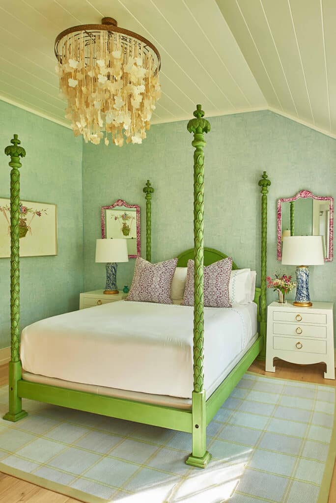
One of Thomas’ most spectacular finds was a green-painted four-poster bed that once belonged to Elsie de Wolf, the doyenne of modern American design. It now graces the bedroom of a daughter, and it is, he says, a perfect expression of her “colorful bubbly personality.”
Indeed, Thomas says, the whole family is colorful, something he tried to convey through the sophisticated eclecticism of the design.
Mission accomplished.






![Tucked along the shoreline of West Neck Harbor, this Shelter Island retreat offers a rare opportunity for relaxed waterfront living. ☀️⚓ With a waterside pool, deep water dock, guest cottage, and 220± feet of bulkhead frontage, every inch of the property is designed to embrace the outdoors. Inside, rich architectural details, sun-filled rooms, and elegant entertaining spaces blend comfort with character, making this a true summer escape.
37 East Brander Parkway, Shelter Island
Represented by Rebecca Shafer @myshelterisland of @thecorcorangroup [link in bio]](https://hamptonsrealestateshowcase.com/wp-content/uploads/sb-instagram-feed-images/515283061_18519694612030135_1293239383085970748_nfull.webp)
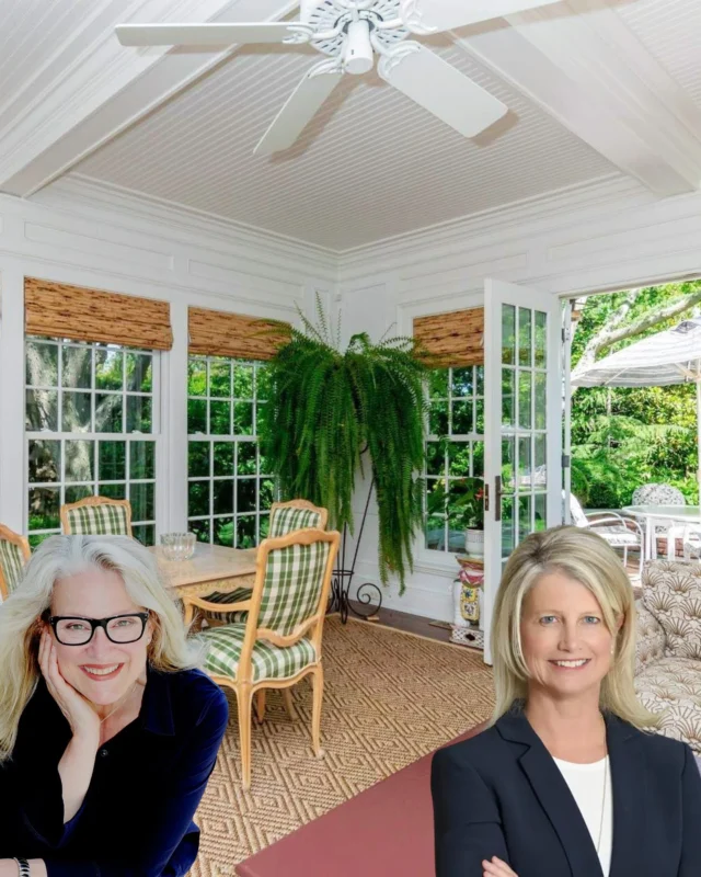


![A private Sag Harbor retreat with timeless elegance and space to roam 🌿 Set on 6.5± secluded acres, this beautifully designed estate offers over 8,000± square feet of refined living, with layered outdoor spaces, a 50-foot gunite pool and spa, and ever amenity needed for effortless Hamptons Living.
47 Middle Line Highway, Sag Harbor Represented by @theenzomorabito of @douglaselliman [link in bio]](https://hamptonsrealestateshowcase.com/wp-content/uploads/sb-instagram-feed-images/513860206_18518605354030135_4589361988158119558_nfull.webp)
