Holly Waterfield redesigns a New York City loft to reflect a lifestyle influencer’s distinctive sensibility
Rental apartments are seldom subjected to major re-dos by their tenants. Patrick Janelle’s New York City loft in the Flatiron district is a stylish exception. Before he’d even moved in, he’d secured the landlord’s permission to refurbish the place and arranged to have a wall taken down. Given that Janelle is a so-called lifestyle influencer, it was understood from the beginning that his new loft, which had, by all accounts, seen better days, would be the object of nothing less than a full-on transformation.
Shrewdly, he didn’t attempt to do so all on his own. It turns out that even influencers can benefit from the skilled eye of a pro. Enter Holly Waterfield, the principal interior designer at the Brooklyn Home Company and the founder of her own eponymous design studio. “Patrick wanted to make big changes, but since he didn’t own the place, he didn’t want to spend tons of money on the project,” says Waterfield, who worked closely with Janelle to put his distinctive stamp on the place. “The original floor plan was choppy and the kitchen was horribly dated, but you could see that the loft had incredible bones.”
After taking thorough stock of the space, the two set about creating a more open floor plan. Janelle entertains a great deal, so it was all-important that the relatively small loft was conducive to hosting and could accommodate guests in high style. To fulfill that brief, Waterfield placed special emphasis on the compact kitchen, which had floors that were some four inches higher than those in the rest of the loft. Rather than expand the cooking space — which would have consumed a precious chunk of floor space — she dispensed with the island, tidily increasing storage space in an aesthetically pleasing way.
“At first, Patrick was like, Whoa! That’s crazy!” Waterfield recalls. “But he really wanted a European-style apartment and that meant no island.” Waterfield and Janelle replaced the existing tile with hardwood floors to match those in the central living space so that one flowed into the other, aligning the formerly raised kitchen with the rest of the loft into the bargain. But the real gain was organizational. They built floor-to-ceiling cupboards in the found space and replaced the island with a small café table (positioning a larger farmhouse table paired with Breuer chairs nearby).
“For me, as a designer, it was exciting to say, Let’s not cram a big suburban kitchen into a space that was never meant to have one and have really efficient cabinets and a hidden coffee station, all on one wall.” As Waterfield notes, it wouldn’t have worked for a family with children, but it’s the perfect arrangement for a single person or a couple. “It was small moves like those that made a big difference.”
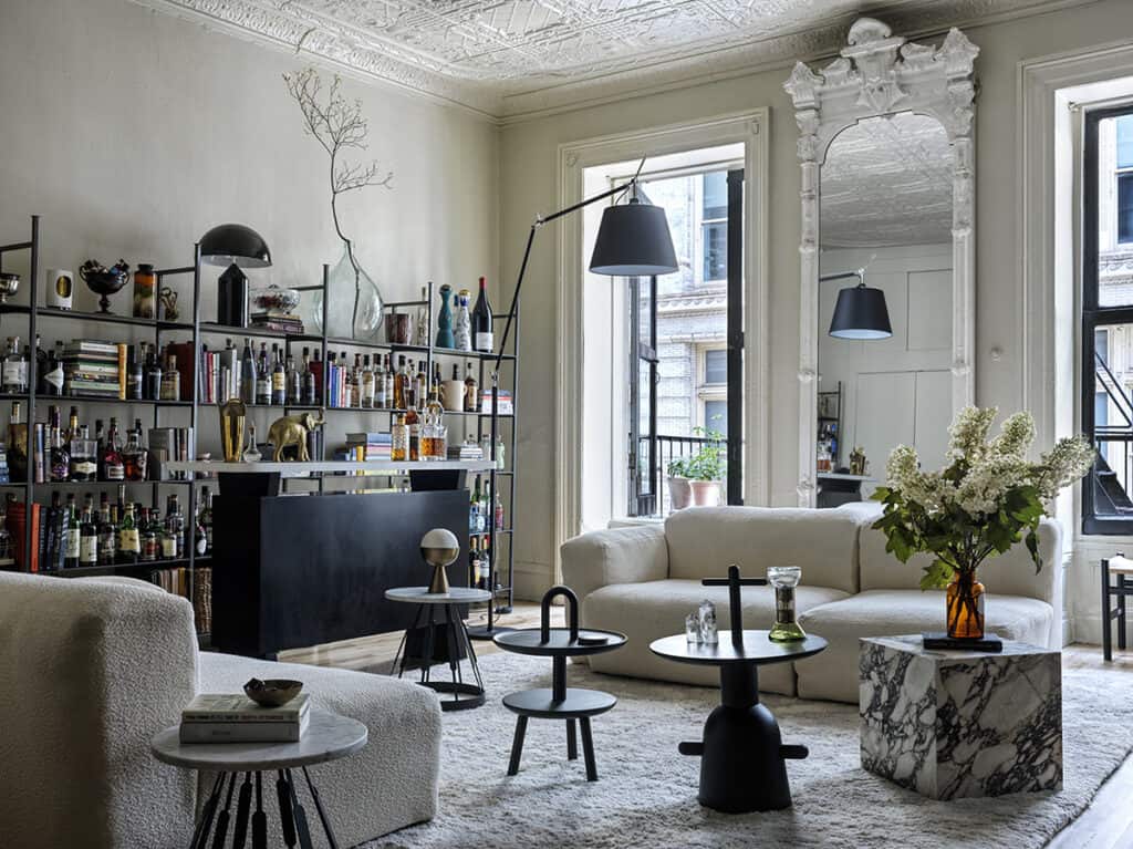
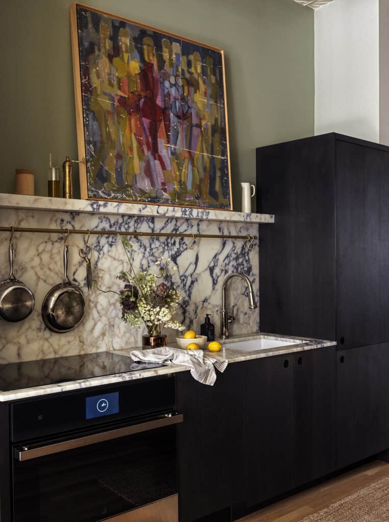
Waterfield’s other bold moves were aesthetic. She combined ultra-modern smoked oak cabinets by the Danish company Reform with an aged brass pot rail and a dramatic backsplash of purple-veined Arabascato marble — a stylistic gamble that paid off and then some. To further equip the loft for entertaining, she and Janelle built a bar area and created extra storage for dishwater and cocktail paraphernalia (note the bookshelf cum wine rack in the central living-dining space).
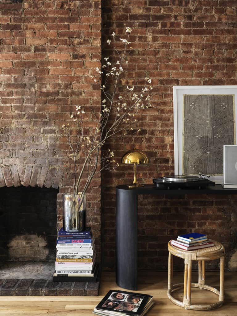
Once the structural pieces of the puzzle were in place, she and Janelle refined the overall feel of the loft with a view to evoking a Parisian apartment. To this end, they preserved its high tin ceilings, moldings, and non-working yet atmospheric fireplace — and painted the grungy white window frames black, thereby bringing the central living space into sharp focus. “Not a lot of renters would have had the nerve to do that,” says Waterfield, referring to the decision to paint the window frames black. It was a kind of ‘I-could-lose-my-deposit-over-this’ moment. But Patrick went for it!”
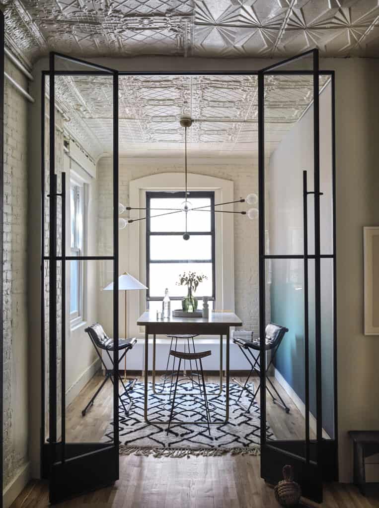
They also created an un-office-y office (think vintage stools and an ombré mural in hues of blue and green by Calico) in a corner of the loft: a pair of folding glass and steel-framed doors, fabricated by Kent Steel Co., mark off the work space while allowing light to filter through to the rest of the loft. The office alcove is anchored by an Apparatus chandelier that’s a bit of a wow.
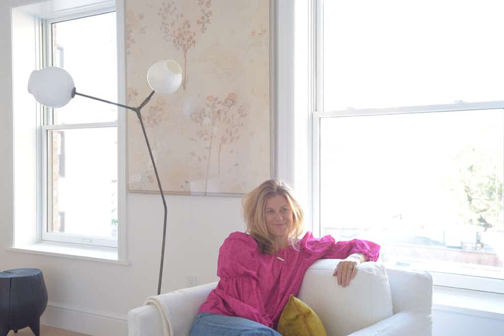
Lighting splurges notwithstanding, they sourced budget-minded pieces that ran the gamut from traditional to mid-century to countrified. The resulting interiors, which feature items from shops in Europe and flea market finds, exhibit a kind of unified eclecticism. “Patrick is such an individual,” says Waterfield, “that there was no way we were going to take the interiors in just one direction. As a fashion person, he has his own look that’s part classic and part hip-hop and the loft reflects that sensibility. It’s all him.”





![Local landscapes, reimagined in oil 🎨 @patgarrityhamptons brings the beauty of the East End to canvas, capturing the emotion, atmosphere, and seasonal shifts that make the Hamptons so unique. Her creative eye doesn’t just inform her art, it enhances her real estate work too, helping clients see what’s possible and appreciate what’s already there. [link in bio]](https://hamptonsrealestateshowcase.com/wp-content/uploads/sb-instagram-feed-images/521901258_18522831946030135_2198226394962818798_nfull.webp)


