
Design fundamentals to help decorate your home
Hiring an interior designer is preferred by many while decorating their homes, but that doesn’t mean everyone consults a pro when hanging a picture or setting out a vase. Fortunately, there are basic design principles we can all follow to make our DIY decor look more polished.
“Intentional decor styling can make a dramatic difference in any space, and styled vignettes are often the final flourish that helps infuse personality and authenticity into a space,” said Kathy Kuo, founder and CEO of Kathy Kuo Home in Southampton.
Styling isn’t a natural talent for all, however. Some need an education before they can be trusted to take on a space. So, before you pick up a hammer, here are some insider tips and general rules of thumb to keep in mind.
‘Rule of Threes’
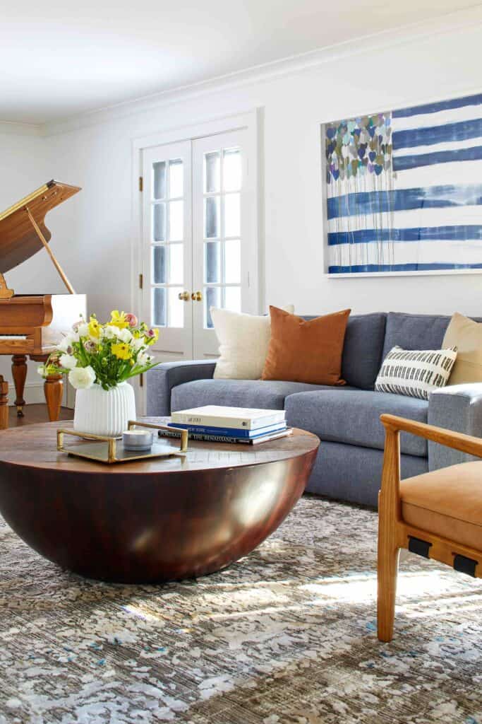
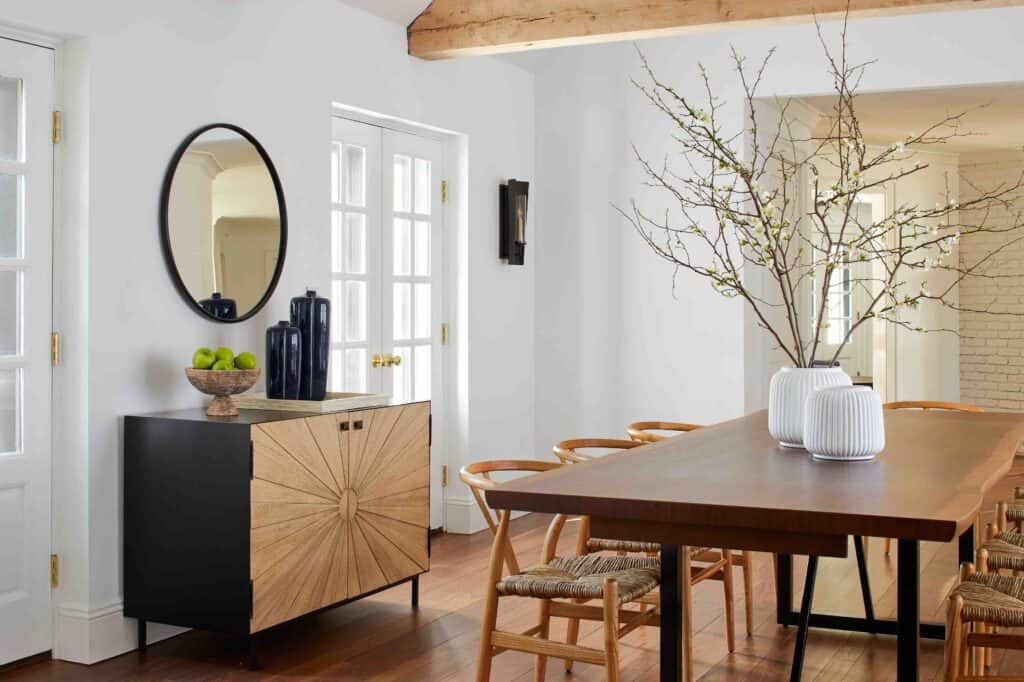
“It can be daunting to get started when you have a variety of items you love and aren’t sure of how to arrange them,” Kuo said. Enter, the ‘Rule of Threes.’ When styling a vignette on a coffee table, bookshelf, mantel or console, build around three key elements: one vertical (like a vase of flowers or standing framed photo), one horizontal (like a stack of art books) and one sculptural (a dramatic crystal or seashell). The mix of sightlines, combined with the contrasting sculptural element, feels put together, “and it leaves room for infinite combinations of artistic and practical items,” the designer explained.
Go Bigger and Lower
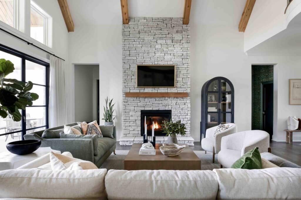
There are two common mistakes when hanging things on walls: putting them too high and choosing pieces that are too small. Whether it’s one big painting or a gallery of framed pieces, you want it to be in your range of view and proportionate to the wall it’s on, designer Emily Henderson explained on her blog. The eye-level rule can be tricky since humans are built at varied heights, so try using your ceiling as a guide. “If the wall were cut up vertically into four sections (going from bottom to top), then think of the art being in the third quadrant,” Henderson said. As for size, art should engage as much of the wall it’s on as possible. “Slightly ‘too big’ art is always better than too small,” she advised. “It looks like you made a really cool choice instead of a size accident.”
Timeless Over Trendy
In our fast-paced world, it’s tempting to jump on every viral trend with the word “core” pinned onto the end, Kuo admitted. Keeping up with these aesthetics can be fun, but it’s also impractical and harmful to the environment. For the bigger items, go timeless. “It’s easy to enjoy trends of the moment through smaller pieces like throw pillows and shelf decor,” Kuo said, “but for your anchor furniture, trust me, you want something that is built to last.” Think long-term use, agreed Stephanie Schroeder, founder of the interior design firm Alchemy Studio. “This might mean having a custom bookshelf made in an office to span the whole wall and utilize the ceiling height versus buying a premade bookshelf where its size might not maximize the space,” she said.
Contrast is Key
We’ve all seen that the all-neutral palette of warm whites, beiges, tans and grays is popular right now, but keep in mind that contrast is key to harmonious and luxurious design. “In my own home, I have a largely neutral-toned living room design, but the strongest visual anchor point is my sage green velvet sofa,” Kuo said. “This pop of color and rich texture create a focal point that frames all of my lighter-colored details and other textures.” Contrast is an easy way to create a whole new look, Schroeder added. “You can change an entire space with only one detail,” she said. “Fresh paint or wallpaper can entirely transform a room without changing the rest of the furniture or decor.”


![Festive flavors, candlelit corners, and winter menus worth the splurge 🍷 This season’s dining scene brings elegant French favorites, seasonal seafood, and cozy classics to the East End table. Whether it’s brunch, dinner, or something in between, these spots are celebrating the holidays in style. [link in bio]](https://hamptonsrealestateshowcase.com/wp-content/uploads/sb-instagram-feed-images/589526657_18551254843030135_4235854489711269175_nfull.webp)
![Space reservations are closing soon for the Holiday / New Year Issue of Hamptons Real Estate Showcase 🎁 This double issue comes with expanded reach, now landing in South Florida as well. Start the new year with premium visibility among luxury homeowners from the Hamptons to Miami. [link in bio]](https://hamptonsrealestateshowcase.com/wp-content/uploads/sb-instagram-feed-images/588642217_18550541596030135_1974828802096238970_nfull.webp)
![Holiday hosting is all about the details 🕯️ This season’s tabletops mix nostalgic charm with fresh touches. Think layered textures, seasonal greens, and flickering candlelight. Whether it’s a quiet dinner or a festive feast, there’s beauty in every setting. [link in bio]](https://hamptonsrealestateshowcase.com/wp-content/uploads/sb-instagram-feed-images/587562593_18550195297030135_5307983913708101790_nfull.webp)
![There’s no shortage of thoughtful, design-forward gifts to discover across the East End this season 🎁 Whether you're shopping for a hostess, a homebody, or someone who simply loves beautiful things, we’ve rounded up a few local finds that are sure to surprise and delight. [link in bio]](https://hamptonsrealestateshowcase.com/wp-content/uploads/sb-instagram-feed-images/587623967_18550040371030135_5392968951052147490_nfull.webp)