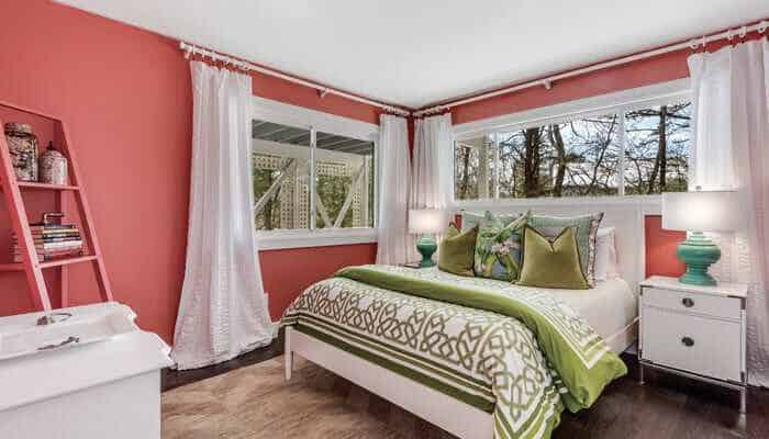
The hues that come to mind when one thinks of coastal design in the Hamptons often include shades of blues and greens accented by neutral tones of sand and driftwood. On the opposite end of the spectrum is a vibrant but mellow color that warms and comforts in a continually changing environment. Pantone’s Color of the Year Living Coral is described as an animating and life-affirming coral hue with a golden undertone that energizes and enlivens with a softer edge. Though you may have to travel to more tropical climates to discover it in nature, this pop of color is a welcomed complement to our modern coastal décor.
While her personal style lends itself more towards neutral tones, Douglas Elliman licensed real estate salesperson and staging professional Sandra Wittich finds the color ideal for accessorizing a space. “I would use a real piece of coral in this color on top of a stack of neutral bound books on a coffee table or picture frames in this color on bookshelves,” she explains. “Incorporate pillows in this tone on a couch, bedroom or slipper chair to tie it into a room in a more subtle fashion.”
Though the title of Color of the Year sets Living Coral apart, Pantone also releases an annual PANTONEVIEW Home + Interiors Guide. There are 72 forecasted hues for 2019, broken into palettes like the culinary-inspired “Cravings” and the fundamental and everlasting “Classico.” The latter can be easily incorporated into Hamptons living spaces.
“Mallard Blue and the Golden Beige tones would definitely work well in many of the homes I tend to work in since they are more of a classic tone,” Wittich says. “It seems clients are more open to something that feels less trendy and bold.”
Described as emitting the desired, familiar, and energizing aspects of color in nature, Living Coral is multi-faceted in what it represents. It is elusive, vivid, and mesmerizing. It was chosen for 2019 in reaction to technology and social media’s overwhelming influence in daily life in an effort to renew the longed-for human connection.
For interior designer James McAdam, Living Coral has always been color of the year. Adding a pop of coral makes a splash in Hamptons décor, especially on the exterior. Think a coral-striped pool umbrella or piping on lounge chair cushions and pillows. It creates a bold yet elegant design and thought-provoking discussion.
“When every other boy in high school had a crush on someone named Jane or Mary, I had a crush on Coral,” McAdam quips. “It’s like living inside a conch shell. From a crushed velvet wing chair to grasscloth wallpaper you can’t help but smile when you see the color coral.”
Halstead Real Estate licensed real estate salesperson Timothy O’Connor has a background in the fashion industry and experience in interior design. Understanding the trend of bringing the outdoors in, something that has made a strong showing in the last several years, he finds Living Coral is ideal for this, bringing the beach indoors and adding great excitement for home décor.
“It is bright but not overpowering and the color is warm and inviting,” O’Connor shares. “While it is important to feature white as a significant color complementing Living Coral, kelly or fern greens along with darker shades of blue are great coordinating colors that can tie the entire space together.”
It will be another exciting year in design as Pantone 16-1546 Living Coral graces color palettes in interiors, exteriors, and fashion throughout 2019.




![Join us May 6th at The Harmonie Club for the Spring Salon Luncheon, a beautiful gathering in support of a truly meaningful cause. Together, we’ll raise critical funds and awareness for @campgoodgriefeeh—@eastendhospice’s summer bereavement camp helping children and teens navigate loss with compassion, connection, and healing. [link in bio]](https://hamptonsrealestateshowcase.com/wp-content/uploads/sb-instagram-feed-images/491527001_18506092897030135_3117653411609489602_nfull.webp)
![Welcome to this exquisite custom-built home in the prestigious Quogue South estate section, just moments from Dune Road and some of the world’s most breathtaking ocean beaches. Completed in 2024, this expansive shingle-style residence offers 6 beds, 7 full and 2 half baths, a separate legal guest cottage, heated gunite saltwater pool with spa, all set on a beautifully manicured 0.74± acre lot. Represented by @lauren.b.ehlers of @brownharrisstevens. [link in bio]](https://hamptonsrealestateshowcase.com/wp-content/uploads/sb-instagram-feed-images/491516869_18505931593030135_4655757731678000577_nfull.webp)
![Discover 11 Oyster Shores, a unique marriage of thoughtful design, uncompromised execution and meticulous craftsmanship expressed across nearly 6,000± sq. ft. of highly curated living space. Brought to life under the watchful eye of Blake Watkins, the visionary behind WDD, the project is a refreshing departure from the ordinary. Represented by @nobleblack1 of @douglaselliman. [link in bio]](https://hamptonsrealestateshowcase.com/wp-content/uploads/sb-instagram-feed-images/491440257_18505740808030135_9064730571228880657_nfull.webp)
![Reserve your ad space now in the Memorial Day “Summer Kick-Off” Issue of #HRES! 🍋 Be seen by high-end buyers and sellers across the Hamptons, Manhattan, and South Florida—just in time for the start of the season. Secure your spot today and make waves this summer 🌊☀️ [link in bio]](https://hamptonsrealestateshowcase.com/wp-content/uploads/sb-instagram-feed-images/491441694_18505573426030135_4475989184561040528_nfull.webp)

![Tuesday, April 15, was Tax Day for most, but for someone in Palm Beach, it was closing day! The nearly 8,00± sq. ft. Mediterranean-style residence at 240 N Ocean Boulevard, with direct ocean views and a private, 100-foot beach parcel, closed at exactly $26,670,750. The seller was represented by Jack Rooney of @douglaselliman and Elizabeth DeWoody of @compass while Dana Koch of @thecorcorangroup brought the buyer. [link in bio]](https://hamptonsrealestateshowcase.com/wp-content/uploads/sb-instagram-feed-images/491445351_18505056166030135_4907944420436119099_nfull.webp)
![Previously featured on our 2024 Columbus Day issue cover, 74 Meeting House Road has officially sold! This stunning new construction in Westhampton Beach offers the perfect blend of thoughtful design and timeless style. Congratulations to @kimberlycammarata of @douglaselliman who held the listing! [link in bio]](https://hamptonsrealestateshowcase.com/wp-content/uploads/sb-instagram-feed-images/491441951_18504901357030135_2664904795600183799_nfull.webp)
![Located South of the highway in Southampton this 4 bedroom, 5.5 bath multi-story property, offers extensive exterior architectural detail throughout. 60 Middle Pond Road offers breathtaking views and tranquil living, nestled along the serene shores of Middle Pond and Shinnecock bay. Represented by @terrythompsonrealtor @douglaselliman. [link in bio]](https://hamptonsrealestateshowcase.com/wp-content/uploads/sb-instagram-feed-images/491451873_18504686110030135_5284427082339135969_nfull.webp)
