While it’s likely premature to write a eulogy to the white kitchen, this much is clear: color is back in style. It’s a new decade, after all, and with it comes a new, bright, distinctive look. Where has color reared its head of late? Non-neutral palettes have appeared in every room of the house, but there are a few trends that are gaining steam.
Patterned tile has risen in popularity in the past few years. Once the provenance of boutique tile purveyors, colored, patterned tile — especially in styles reminiscent of the tilework found in Barcelona, Portugal, and Morocco — can now be found at more conventional stores, too. Cement tiles with bright, colorful patterns can add interest to small spaces, like powder rooms. Paired with more neutral tones, they can work in much the same way as an accent wall, offering a visual delight that won’t overwhelm the room.
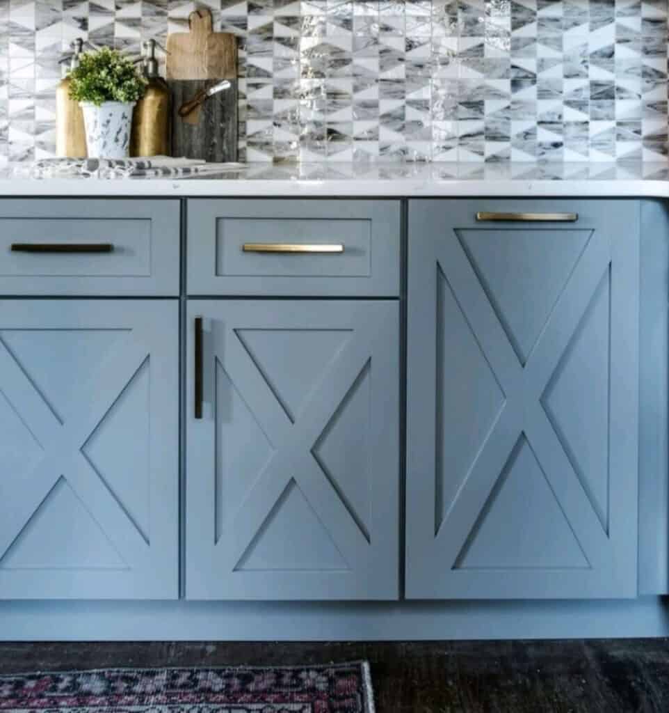
In the kitchen, handmade ceramic tile and colorful tile in interesting shapes provide a vignette. Rich blues and greens are always a good choice, particularly if countertops are white, gray or veined. Moroccan inspiration has found its way to the kitchen, too, where the arabesque pattern of mosaic tile is now seen as an upgrade to plain old subway tile. Shape, texture, and color can change the entire look and feel of a kitchen.

Speaking of kitchens, a rising trend of late is colored cabinetry. Deep navy and green are two colors that speak to the new wave of color. For those who don’t want to commit to an entire palette of rich color in the kitchen, but still want to broaden the spectrum, two-tone cabinets are a nice compromise. Upper cabinets painted in white or neutral tones lengthen the space and keep things light and airy, while painted lower cabinets add visual interest. Or, consider painting only the center island in your kitchen, for a true pop in an otherwise neutral room.
Pantone declared Classic Blue the official color of 2020. This Colonial-esque shade of the primary color is both traditional and new again, a color made popular by the rising trend of approachable color and by a narrative that has shifted — finally — away from all white. But if Classic Blue feels a little too blue for your floors, kitchen island, or backsplash, take your inspiration from color craftsmen Farrow & Ball. Hague Blue No. 30 is nearly slate gray, a blue-neutral that looks good in nearly any room. And the company’s less traditional Vardo shade is more green than blue, a welcome addition for anyone stuck between colors.
Still, even if blue isn’t exactly your bag, you can get in with the trend by pulling color into small spaces. Whether it’s patterned tiles on the floor, a painted island, or a popping new backsplash, the color movement is the design trend of the year — and maybe even of the decade.


![Homeowners are faced with the daunting task of choosing the right kitchen design — one that will remain timeless for both entertaining and day-to-day functionality. With a focus on luxury, clients are increasingly leaning towards clean, modern aesthetics but are hesitant to embrace a fully contemporary look. [link in bio]](https://hamptonsrealestateshowcase.com/wp-content/uploads/sb-instagram-feed-images/467244043_1082221510295882_2208387561574057218_nfull.webp)
![Experience the epitome of coastal country living in this newly constructed, quality craftsmanship waterfront home on James Creek, leading to Peconic Bay. With 80± ft. of prime waterfront, 4060 Ole Jule Lane showcases thoughtfully landscaped grounds, a bluestone patio, outdoor shower, and a refreshing saltwater pool. Represented by @nataliealewis of @coldwellbanker. [link in bio]](https://hamptonsrealestateshowcase.com/wp-content/uploads/sb-instagram-feed-images/467188671_18474458155030135_7164624532118372206_nfull.webp)
![Welcome to 122 Mill Pond Lane, an impeccably conceived and meticulously maintained residence in a dramatic west-facing setting on Mill Pond. Throughout the home are thoughtfully considered elements that reinforce the home’s clean, modern sensibility. Represented by @kraelyllahamptons of @hamptonsrealestate. [link in bio]](https://hamptonsrealestateshowcase.com/wp-content/uploads/sb-instagram-feed-images/466787127_18474263443030135_2753720635361764689_nfull.webp)

![Perched atop the dunes at Louse Point sits 2 picturesque homes at 88 & 86 Louse Point Road, both perfect for enjoying all seasons that East Hampton has to offer. Each thoughtfully designed home maximizes the topography to allow seamless indoor/outdoor living and entertaining. Represented by @petrieteam of @compass. [link in bio]](https://hamptonsrealestateshowcase.com/wp-content/uploads/sb-instagram-feed-images/466619407_18473886082030135_7330054085188815713_nfull.jpg)
![Get cozy every Friday at Canoe Place Inn! 🍫🔥 Gather around the fire on our Garden Lawn for Fireside Fridays all season long, where evenings are warmed up with hot cider, hot chocolate, s’mores, and cocktails. Enjoy live acoustic music on select dates, and with your first drink, receive a complimentary s'mores kit! [link in bio]](https://hamptonsrealestateshowcase.com/wp-content/uploads/sb-instagram-feed-images/466374901_1761070534297706_6837753985329213061_nfull.jpg)
![Musical Superstar and Sag Harbor resident Billy Joel has listed his 26± acre Long Island estate for $50M. Assembled over time on adjoining parcels, the Centre Island compound features a 20,000± sq. ft. main home plus several additional structures—all with access to 2,000± ft. of private shoreline boasting a dock and a boat ramp. [link in bio]](https://hamptonsrealestateshowcase.com/wp-content/uploads/sb-instagram-feed-images/465973748_18473309701030135_6935355293028123088_nfull.jpg)
![51 Mashomuck Drive presents an exquisite estate spanning 1.1± acres with 145± ft. of bulk-headed waterfront. The main residence, offering captivating vistas of Sag Harbor Bay and Shelter Island, encompasses 7,800± sq. ft. of living space, boasting 7 beds, 9.5 baths, and a media room/gym area. This turn-key retreat embodies opulence and comfort, inviting a life of unparalleled luxury. Represented by @cindyascholtz and @jvonhagn of @compass. [link in bio]](https://hamptonsrealestateshowcase.com/wp-content/uploads/sb-instagram-feed-images/466104990_18473128246030135_2802294086252776198_nfull.jpg)
