

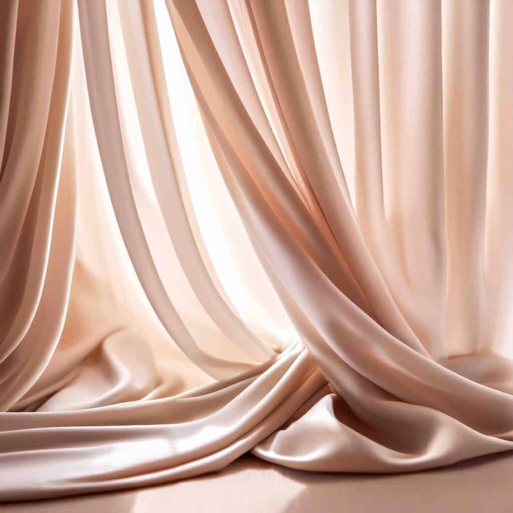
Mocha Mousse Pantone has been declared Color of the Year for 2025.
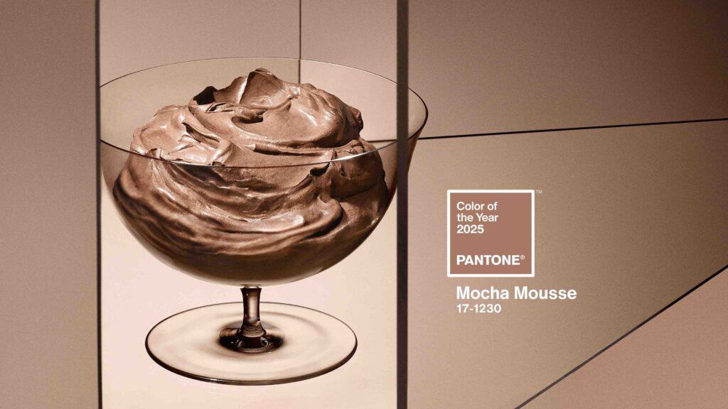
Could brown be the new black? If Pantone, the global color authority, has its way, we may be embracing a chocolaty hue in everything from upholstery to clothing. Mocha Mousse Pantone 17-1230 has been declared Color of the Year for 2025. The company describes it as “a warming, brown hue imbued with richness. It nurtures us with its suggestion of the delectable qualities of chocolate and coffee, answering our desire for comfort.”
Pantone provides a universal language of color relied on by more than 10 million designers around the world, according to the company. This is the 26th year Pantone has sought to capture the “global Zeitgeist” by selecting a color of the year.
Mocha Mousse replaces last year’s bright and airy Peach Fuzz and the audacious Viva Magenta of 2023. Pantone partners who will feature the new color in their products include Motorola, Joybirds furniture and fabrics, Spoonflower wallpaper, IPSY makeup, JANAVI cashmere, and Post-it notes among others.
“For Pantone Color of the Year 2025, we look to a mellow brown hue whose inherent richness and sensorial and comforting warmth extends further into our desire for comfort and the indulgence of simple pleasures that we can gift and share with others,” says Laura Pressman, vice president of the Pantone Color Institute.
Back in the day when Julia Child had everybody learning to cook French things, chocolate mousse was a dessert darling. In recent years, it had pretty much been exiled to culinary Siberia. But now, just add a little coffee or even coffee liqueur and you have a whole new thing — Mocha Mousse. You may be surprised how many times you’ll be eating this as the year goes on.
When you envision the palette extending out to a very pale cannoli cream or a deep chocolate Martini, it’s easy to see how shades of Mocha Mousse are likely to be even more ubiquitous in design for the home.
“An evocative rich brown infused with sensorial warmth PANTONE 17-1230 Mocha Mousse blends our desire for comfort and opulence to present a tasteful touch of glamour. An earthy yet refined brown PANTONE 17-1230 Mocha Mousse nourishes our senses. Sophisticated and lush, yet at the same time an unpretentious classic, PANTONE 17-1230 Mocha Mousse evokes a feeling of the comfort of home whether appearing on flooring or a painted wall, within home décor or in more natural materials including wood and stone, rattan and wicker, leather and linen,” according to the company.
We checked in with some designers to ask how Mocha Mousse might be used in Hamptons homes.
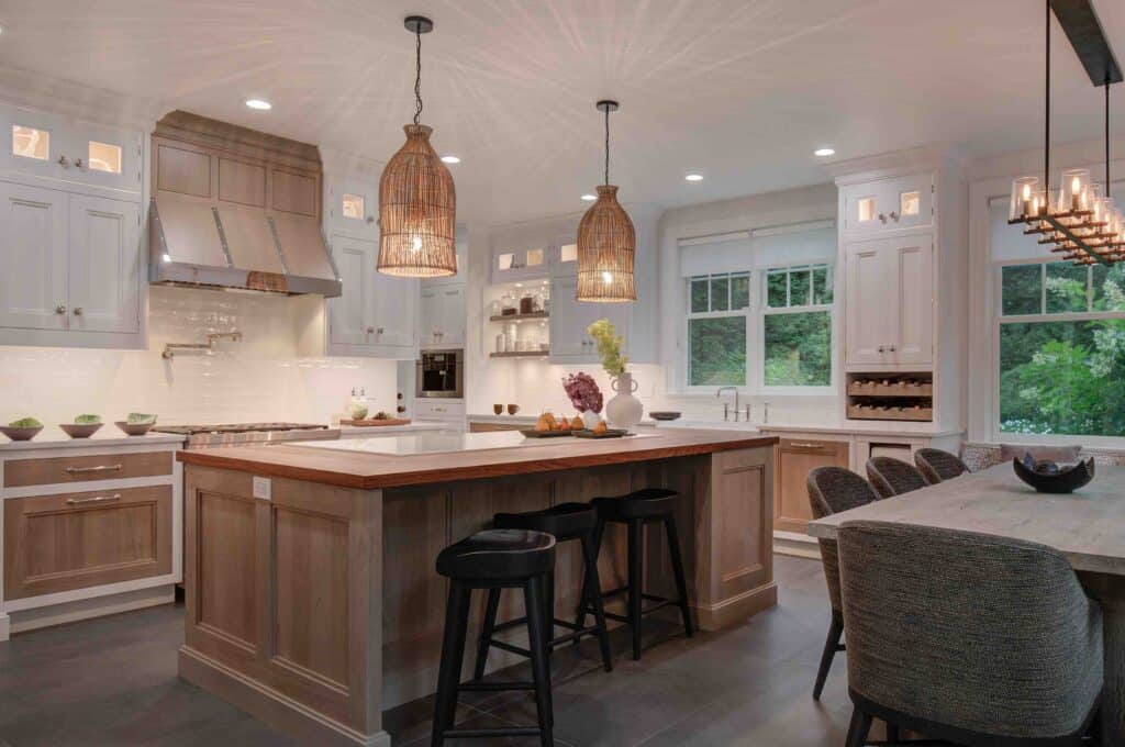
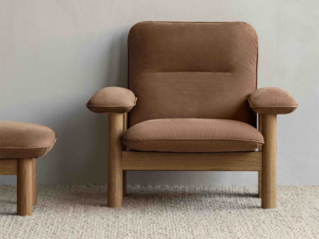
Bob Bakes, Co-Founder and Head of Design at Bakes & Kropp shared his thoughts of how the color can be used in kitchen design. “Mocha Mousse has a polished yet earthy energy that would pair nicely with natural materials like wood or stone. It can create a cozy, inviting atmosphere and feels versatile enough for cabinetry, backsplashes, or color drenching, providing a grounded backdrop that lets other colors pop. It would also work well in our signature Soft Modern style, which balances modern-leaning aesthetics with more classic elements,” says Bakes who’s responsible for numerous high-end Hamptons kitchens.
“As a warm brown that feels close to nature, I find that this hue captures our desire for connection and comfort,” Bakes continues. “It combines sensorial opulence with understated refinement, offering designers a fresh, unified palette that complements both bold and subtle palettes.

“Mocha Mousse evokes comfort and sophistication. As a warm, rich neutral, it has a timeless quality that works beautifully in both contemporary and classic spaces.”
Beyond the kitchen, Mocha Mousse is likely to be prominent in other living areas as well according to home furnishings expert Kathy Kuo, founder and CEO of Kathy Kuo Home. “There has really been a strong movement towards warm neutrals over the past couple years, so it’s no surprise that a subtle, yet luxurious, color like Mocha Mousse is the new Color of the Year!” says Kuo. “The best thing about this color is its versatility; it’s a warm and light brown that feels very nuanced, so you could easily use it front and center — in the upholstery for your sofa, for example — or as an accent hue — in decorative pillows or in a throw rug perhaps. I also love the fact that you can take this color to a very upscale place with a French country or mid-century modern aesthetic, or style it in a more laid-back way in a coastal beach or modern farmhouse-style home.”
For Hamptons homes, where a beachy vibe is desired, Aino Heinäsuo, Head of Design at Redecor, suggests “pairing it with lighter shades like beige and white. Use it as an accent in smaller elements, such as pillows or decor pieces, to create a fresh and breezy look. Using this color too heavily in larger areas could make the space feel dim and dark, which is the opposite of the bright and airy aesthetic typically associated with a beachy vibe. Keeping it as an accent ensures it adds depth without overpowering the lightness of the overall design.
“This color perfectly embodies the shift toward warm, neutral, earthy tones,” Heinäsuo continues. “We’re increasingly seeing palettes that stay within the same color family, not just in interiors but also in fashion. Personally, I view this color as a fantastic accent — elegant and eye-catching without being overpowering. Its depth makes it ideal for creating contrast, especially when paired with lighter shades that allow it to truly stand out. It exudes warmth and comfort while maintaining a sense of sophistication. However, using it in larger areas requires a bit of boldness, as its richness can make a strong statement.”
“I think this color works beautifully as a wall color or as an accent for an upholstered piece,” Heinäsuo continues. “While I wouldn’t recommend directly translating this color to flooring, similar warm-toned wooden floors can capture the same inviting and earthy vibe, complementing the overall aesthetic.”
Home Entertaining and Lifestyle Designer Fran Berger also believes the 2025 Color of the Year is both sophisticated and comforting. “Mocha Mousse is one of those exceptionally versatile and sophisticated colors that lends a feel-good simplicity to a space with its beautifully soft, warm, and rich medium brown tone that can easily meld with a multitude of colors.
“I would treat Mocha Mousse as a neutral in design, a visually uplifting touchpoint to accent crisp white interiors and hint to the natural beauty of the outdoors,” Berger says. “A side chair upholstered in Mocha Mousse, perhaps with a stamped vinyl animal print fabric, would make a simple silhouette all the more stunning.

“An infusion of the color in the pattern of an accent pillow on a sofa or the perfectly sized kidney pillow on a chair in an entry way feels thoughtful and welcoming.”
Berger also finds it delicious both on the tabletop and in desserts. “For entertaining, Mocha Mousse is a striking choice for side and salad plates, the perfect earthen canvas for serving bold, colorful vegetables like haricots vert, beets, and asparagus or bright green salads. It’s also an artful dessert base for a fine crystal coupe filled with berries and whipped cream or a singular serving of a chocolate bomb in a delightful monochromatic expression. And wouldn’t it be fabulous to have a set of espresso cups and saucers in this color adorned with touches of metallic?”
Beverly Stephen writes about design, food, travel, and lifestyle. She is co-owner of Flavor Forays, a culinary travel company.


![@raphael_avigdor brings his signature boldness and emotional depth to this year’s Art Basel, unveiling a solo show that’s as personal as it is powerful. Presented by London gallerist Rebecca Hossack, the exhibition celebrates his latest photographic book Both Sides Now, a visual homage to the layered lyrics of Joni Mitchell.
The show opens on December 4, 2025 from 6PM–9PM at her newly renovated home and gallery in East Little Havana. [link in bio]](https://hamptonsrealestateshowcase.com/wp-content/uploads/sb-instagram-feed-images/584394178_18549642664030135_1592235407580770939_nfull.webp)
![When clients embrace bold ideas, the results speak for themselves. In this Sag Harbor home, designer Jessica Gersten played with sculptural form and layered textures to create something truly distinctive. From the forged-iron swing to a striking stairwell pendant that anchors the heart of the space, the finished design balances personality and livability in every room. [link in bio]](https://hamptonsrealestateshowcase.com/wp-content/uploads/sb-instagram-feed-images/586881005_18549106426030135_1053520189449566580_nfull.webp)

![Across continents and architectural styles, a distinct vision emerges. 🌎 George Lucas’s real estate portfolio brings together expansive ranchland, oceanfront enclaves, heritage estates, and city landmarks, each chosen with a curator’s eye. From Skywalker Ranch’s 4,700 acres to a secluded stretch of the French countryside, his properties honor place, history, and the pursuit of meaningful design. It’s a collection that speaks quietly, yet with remarkable depth. [link in bio]
📸: Araya Diaz/WireImage, Patrick Durand/Getty Images, Mike Kemp/In Pictures via Getty Images, Google Maps, Google Earth](https://hamptonsrealestateshowcase.com/wp-content/uploads/sb-instagram-feed-images/582214036_18548535424030135_3221221365131655942_nfull.webp)