An interior designer brings a personal touch to a minimalist haven with ocean views
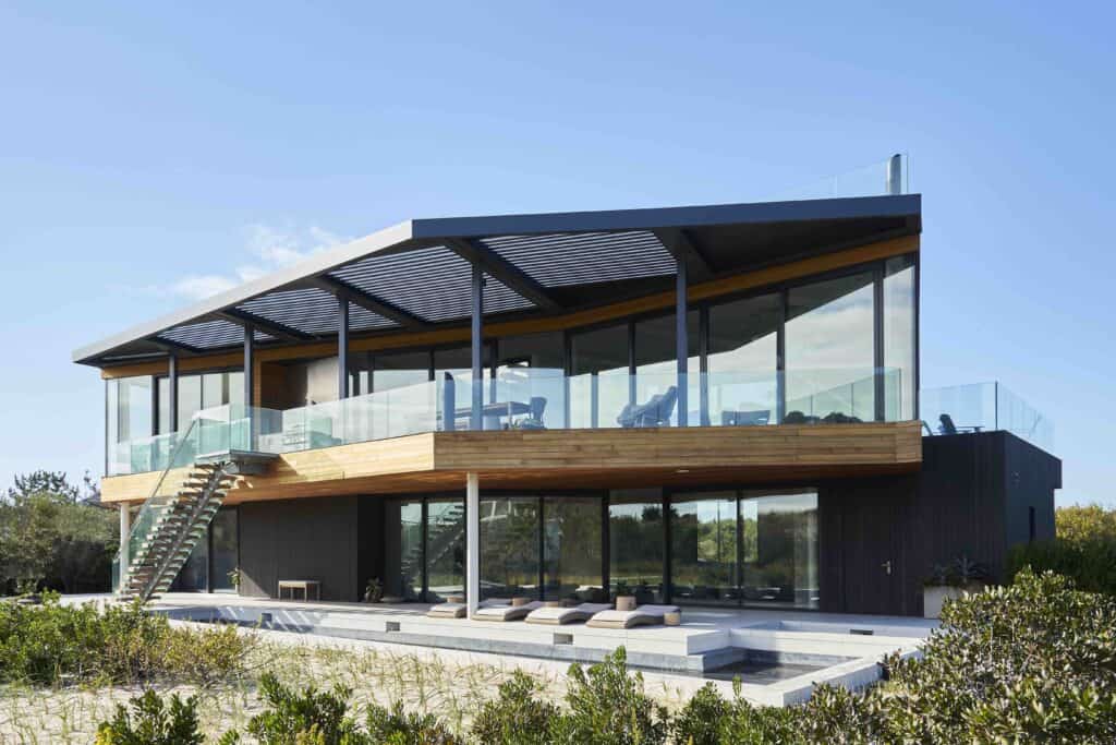
We live in a culture driven by novelty and newness, yet sometimes professional relationships of longstanding lead to the freshest ideas in interior design. Case in point: a 5,280-square foot, two-story ultra-modern cedar-clad house with a roof-deck in Amagansett with sweeping ocean views from the top floor. Set among wind-stunted pines, dune grass and bayberry, the dramatic structure — which consists of two asymmetrically stacked volumes — is the work of Barnes Coy Architects. The interior design is by Elena Frampton, who had worked with the homeowners, a married couple with adult children, on various iterations of their New York City apartment for over twenty years.
By then, Frampton had an intuitive sense of the clients’ style and, as she puts it, “their preferences and all the design elements that were of interest to them.” But ‘style’ is a loaded term. We think of it as referring to surface appearances when in reality it is bound up in intangibles. And if style is unique to each of us, like a thumbprint, how can another person capture and convey it? Interior decorators do it all the time, or at least the good ones do. “My job,” says Frampton, “is to interpret not only what my clients say but what they don’t say. The result is informed by my creative process, which is a bit mysterious.”
In this case she found herself inspired by the house’s setting and structure, the marine light, and the dunes. The latter provided the starting point for her palette — mostly sand-tones with dashes of blue. “A lot of dunes are white-on-white, which can feel cold, but others are sand-colored, and they project warmth. That’s the hue I was going for.”
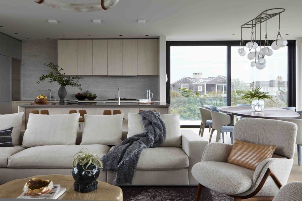
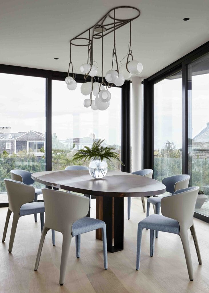
Her brief was to create interiors that chimed with the architecture, and which would serve to aesthetically unify the space and its surroundings. To this end, she deployed furniture in sculptural forms, layers of textiles, and objects that reflected the homeowners’ personalities. A sharp corner in the dining area is softened by the placement of a custom-made dining table in an asymmetrical shape (like the living area, Bulthaup kitchen, and bedrooms, the dining area is on the second floor so as to profit from the sea breeze and ocean views). She also chose rugs in organic shapes and a coffee table that would look right at home in an art gallery.
But comfort weighed heavily on the design calculus. “The clients didn’t want to live in a museum. The house was meant to be enjoyed,” says Frampton. In this regard, the living room, a large open space with views from high windows north and south, presented a puzzle to be solved. “The trick was to create comfortable seating arrangements in an area of heavy circulation.” Frampton’s solution was to anchor the space with an outsize sectional sofa into which she incorporated built-in side tables “to reduce visual clutter”.
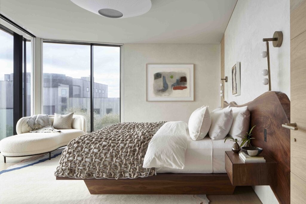
She followed the same visual clutter-reducing formula in the bedrooms. The primary bedroom is an object lesson in simplicity, it features a custom-made bed with an integrated headboard and side tables and glorious views of the Atlantic. “The idea was to have a single streamlined piece of furniture rather than a bunch of different pieces,” she says.
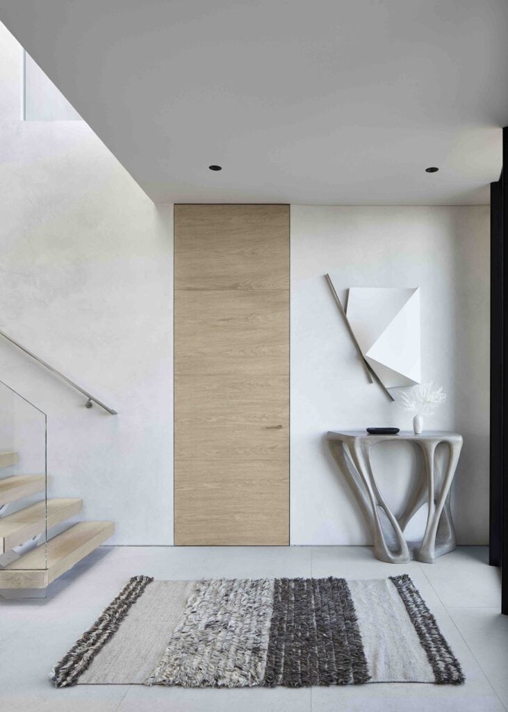
Art was another way of tying the design to the architecture, namely with minimalist works by Ted Kurahara, Michael Boyd, and Sydney Butchkes. And then there is the eye-catching raku wall installation in the entrance hall. Of the latter, she says: “The hallway has an irregular shape, so it didn’t make sense to put a square painting on that part of the wall. We explored different options for something more organic, in which we might have a bit more control over the scale and density of the piece. Raku in particular has such warmth and depth, well, it was the right choice for this house.”
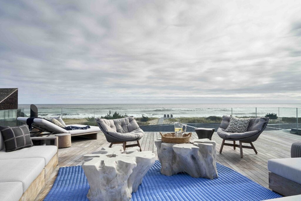
The project proceeded without mishap — and in the end a happy surprise awaited her. “I had planned for every eventuality. We had a Memorial Day deadline and there was a lot of last-minute work going on — from landscaping to architecture to interiors — in the final weeks so it took a lot of coordination. But oh, how lovely, when it all came together. It was the first time a client has ever offered me tequila shots at the installation.”
Photography By Joshua McHugh


![Perched atop the dunes at Louse Point sits 2 picturesque homes at 88 & 86 Louse Point Road, both perfect for enjoying all seasons that East Hampton has to offer. Each thoughtfully designed home maximizes the topography to allow seamless indoor/outdoor living and entertaining. Represented by @petrieteam of @compass. [link in bio]](https://hamptonsrealestateshowcase.com/wp-content/uploads/sb-instagram-feed-images/466619407_18473886082030135_7330054085188815713_nfull.jpg)
![Get cozy every Friday at Canoe Place Inn! 🍫🔥 Gather around the fire on our Garden Lawn for Fireside Fridays all season long, where evenings are warmed up with hot cider, hot chocolate, s’mores, and cocktails. Enjoy live acoustic music on select dates, and with your first drink, receive a complimentary s'mores kit! [link in bio]](https://hamptonsrealestateshowcase.com/wp-content/uploads/sb-instagram-feed-images/466374901_1761070534297706_6837753985329213061_nfull.jpg)
![Musical Superstar and Sag Harbor resident Billy Joel has listed his 26± acre Long Island estate for $50M. Assembled over time on adjoining parcels, the Centre Island compound features a 20,000± sq. ft. main home plus several additional structures—all with access to 2,000± ft. of private shoreline boasting a dock and a boat ramp. [link in bio]](https://hamptonsrealestateshowcase.com/wp-content/uploads/sb-instagram-feed-images/465973748_18473309701030135_6935355293028123088_nfull.jpg)
![51 Mashomuck Drive presents an exquisite estate spanning 1.1± acres with 145± ft. of bulk-headed waterfront. The main residence, offering captivating vistas of Sag Harbor Bay and Shelter Island, encompasses 7,800± sq. ft. of living space, boasting 7 beds, 9.5 baths, and a media room/gym area. This turn-key retreat embodies opulence and comfort, inviting a life of unparalleled luxury. Represented by @cindyascholtz and @jvonhagn of @compass. [link in bio]](https://hamptonsrealestateshowcase.com/wp-content/uploads/sb-instagram-feed-images/466104990_18473128246030135_2802294086252776198_nfull.jpg)
![In a prime East Hampton Village location, 64 West End Avenue is surrounded by preserved land and offers complete privacy situated on the shores of Georgica Pond with breathtaking sunset views. With both ocean and pond views, residents can indulge in swimming and sunbathing at the waterside gunite pool. Represented by @marthagundersenluxurybroker and @paulbrennanrealestate of @douglaselliman. [link in bio]](https://hamptonsrealestateshowcase.com/wp-content/uploads/sb-instagram-feed-images/465766544_18472922440030135_758297788107249653_nfull.jpg)
![Enter into modern luxury at dreamy 26 Breezy Drive. This recently completed Sag Harbor new construction home on .59± acres offers 6 beds, 6.5 baths, blending elegance and style in every detail across 3 floors. Represented by @jfrangeskos of @thecorcorangroup. [link in bio]](https://hamptonsrealestateshowcase.com/wp-content/uploads/sb-instagram-feed-images/465771466_18472728874030135_3201710503931747819_nfull.jpg)

