
Who doesn’t love the fall? Between the colorful leaves and cozying up indoors while the temperatures drop, this is a cherished time of year, especially in an outdoorsy area like the Hamptons. To get into the spirit of the season, it’s fun to use home décor to reflect the changes outside, from decorating tables with natural elements to mixing in this year’s trending colors. For example, one popular pigment is coral, or more specifically “living coral.” It’s the color of the year from Pantone, the unofficial authority on color for design and fashion. “When Pantone announces the color of the year, all design industries listen,” says Bridgehampton-based designer Roxane Mosleh. “It doesn’t necessarily dictate what a client will want, but whether it’s fashion or home or anything related to design, that will dictate [the trend].”
The neutrals being promoted by Pantone, along with Benjamin Moore and other design trend-setters, are still shades of gray, so the orangey-pink is a warm complement to that cooler palette. But while coral, the color of the organisms growing at the bottom of the ocean, may seem like a better fit for spring or summer, there are ways to make it autumnal, Mosleh assures. For example, use a coral accent wall or piece of furniture to liven up a space, and then bring in gold or brown accessories to reflect the season, she says.
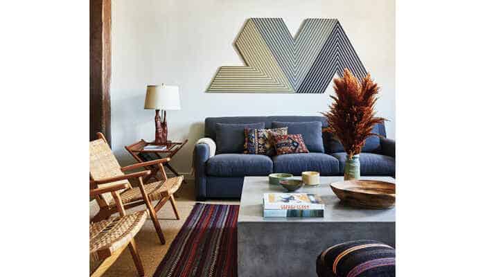
Meanwhile, few color conversations go by without anyone mentioning a new, pale “millennial pink,” another warm hue, notes Andrew Bowen, director of staging for ASH NYC. The city-based design firm has been expanding to the Hamptons and recently opened an office in Sag Harbor. Jewel tones are trending too, he says. “Jewel tones are a little higher in saturation and a little deeper in color, and have a counterpoint in the gem world,” like ruby, topaz, emerald and sapphire, Bowen explains. That being said, “there’s always a classic gravitation toward seasonal colors, especially in interior design,” he notes. “For fall, for me, that’s always been shades of burgundy and amber and gold – the colors that reflect the changing leaves.”
Rather than investing in, say, a brand-new dark red sofa, Bowen suggests sticking with décor that “can be changed by hand,” as he puts it. Think tablecloths, accent pillows, throw blankets and towels. Even books with jackets in those colors can decorate a surface. In his own home, Bowen likes to bring in elements from the natural environment. He fills vases with branches from deciduous trees so his tables are adorned with the season’s bright, fiery leaves. “If you’re designing a room for the first time it’s really easy to layer these colors into anything, but when it comes to seasonal decorating there are a lot of fun ways for people to accentuate their place without changing major components,” he says.
Over at Renee’s, the furnishing and apparel retailer in Mattituck, owner and designer Debra Gildersleeve says these trends are evident in her showroom. Pops of coral and millennial pink peek out among deep red and blue velvet couches. However, she notices that her customers don’t necessarily follow trends. For example, while gold is a popular metal for fall, her clients often prefer brushed silver and chrome. The same goes for colors, she says. Some change their decor to match the pages in design magazines, others stick to their personal favorites.
Her suggestion? “When it comes to color in décor, if you’re really the kind of person who follows the trends and you like change, make sure your base furniture is all very neutral,” Gildersleeve says. “And then if you want to add in a trending color … you can add a crazy bowl on your cocktail table, or a red lamp, and all of a sudden you’re in style.”

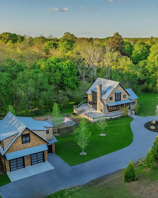
![Indoor/outdoor living has evolved far beyond the patio or poolside seating area 🌿 Today’s most thoughtful homes are designed to blur the boundaries between inside and out, creating spaces that support everything from entertaining and wellness to everyday relaxation. With flexible layouts, durable materials, and a stronger connection to the landscape, the next generation of East End living is focused on how a home feels and functions throughout the year. [link in bio]](https://hamptonsrealestateshowcase.com/wp-content/uploads/sb-instagram-feed-images/710830844_18598759708030135_2167851243877024321_nfull.webp)
![A home should tell the story of the people who live there ✨ Designer @samtannehill of @tannehillinteriors believes the most successful spaces are the ones that feel warm, layered, and deeply personal. Through thoughtful materials, natural color palettes, and an emphasis on how families actually live, her Southampton home reflects a design philosophy rooted in comfort, function, and connection. The result is a timeless interpretation of Hamptons living that feels collected, lived-in, and effortlessly welcoming. [link in bio]](https://hamptonsrealestateshowcase.com/wp-content/uploads/sb-instagram-feed-images/708953286_18598495174030135_5355474848495384064_nfull.webp)