


The Pantone Colors of the Year for 2021 are Ultimate Gray and Illuminating
By Kate C. Patchett
On the heels of a year that left us feeling anything but certain, the proverbial New Year and what it holds is something the world has eagerly awaited. Pantone’s annual release of its Color of the Year is looked forward to by designers each year, but in 2021, it is all encompassing. Endeavoring to convey a message of strength and hopefulness that is both enduring and uplifting, Pantone has released two colors this year – Pantone 17-5104 Ultimate Gray and Pantone 13-0647 Illuminating. Hamptons designers now share their take on the marriage of these two premiere hues and how to incorporate them into East End living spaces.
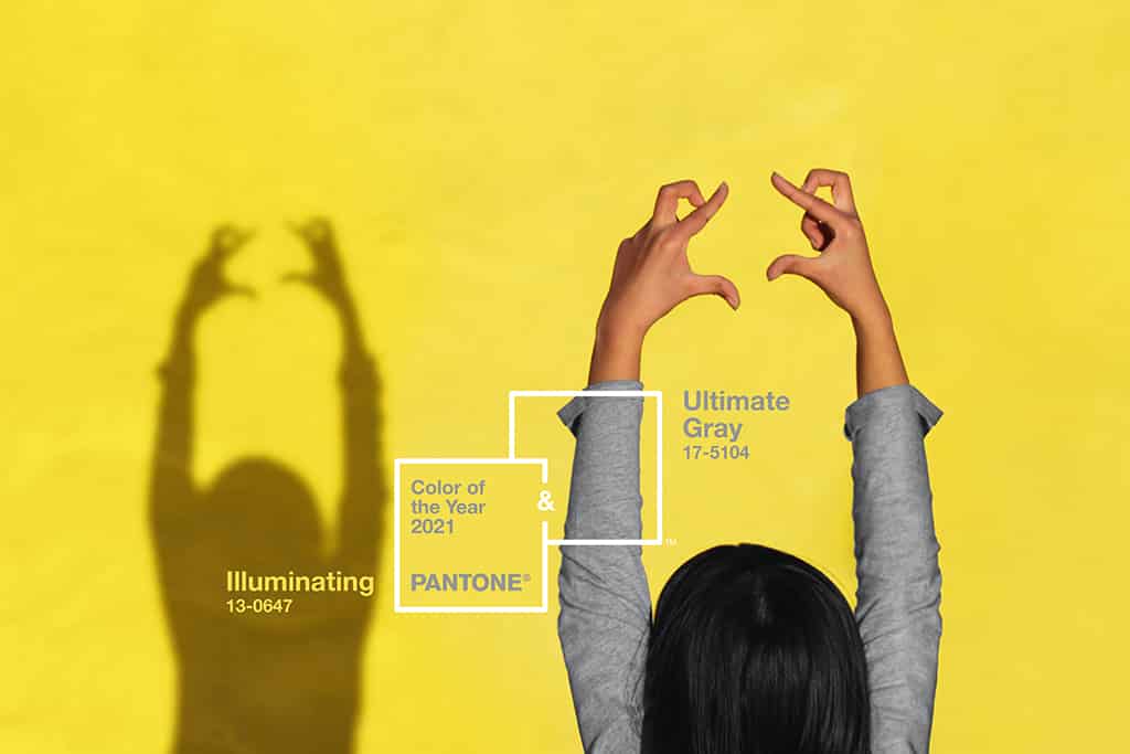
Pantone’s announcement reads: “A message of happiness supported by fortitude, the combination of Pantone 17-5104 Ultimate Gray and Pantone 13-0647 Illuminating is aspirational and gives us hope. We need to feel that everything is going to get brighter – this is essential to the human spirit.” The combination of gray and yellow serve as a strong base for color palettes in design this year, offering a sense of warmth and optimism amidst its practical purpose. This union inspires, giving all who set eyes on the pair a sense of something good to come.
When thinking of Pantone’s choice of the two colors, Brian Ferrick of Meridith Baer Home, a luxury home staging and interior design company, finds a hopeful playfulness paired with a serene calmness. Ultimate Gray works well as a calming background while the Illuminating yellow offers a spirited punch of color as an accent.

“I would use Ultimate Gray for a wall color, paired with a deeper charcoal colored sofa, punctuated with Illuminating yellow pillows in a rich mohair or velvet,” Ferrick envisions. “Add in an accent chair in a rich persimmon and then layer in some chocolate brown and you have a sophisticated library scheme.”
The transition into 2021 has already begun, and society continues to look for ways to bring positivity into their lives as uncertainty continues to overshadow daily life. But hope can prevail, and these two colors can help shape our outlook. Pantone describes Illuminating as a bright and cheerful yellow sparkling with vivacity, a warming yellow shade imbued with solar power, while Ultimate Gray is emblematic of solid and dependable elements which are everlasting and provide a firm foundation.
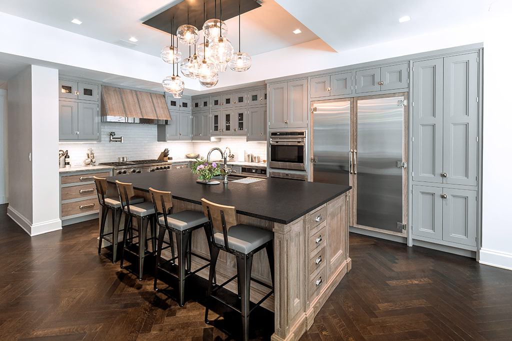
Joe Badilla and associates of Badilla Painters, Inc. find the resilient combination to be cheerful and energetic. “We like incorporating these colors into kitchens as the gray serves as a strong neutral and coordinates with popular appliance finishes,” he shares. “The yellow stirs creative thoughts and boldly boosts energy and excitement. The Illuminating shade simply spreads sunshine and happy colors are always welcome in the kitchen.”
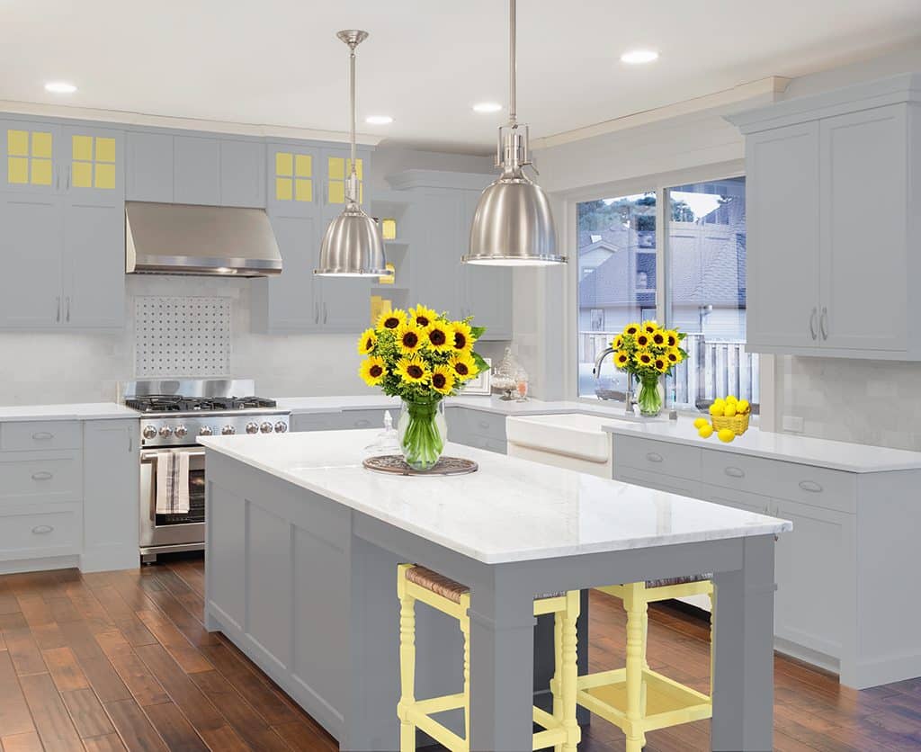
When it comes to refreshing Hamptons homes for spring, Badilla looks toward repainting over replacing. The company suggests refinishing the kitchen cabinets and changing the hardware to give the kitchen a brand-new look and feel. By updating the kitchen cabinet color and shine, the space can be completely transformed without having to completely redesign the entire room. As Hamptons real estate trends continue strong, this refreshing option also allows homeowners and renters to enjoy their spaces now rather than wait for lengthy renovations.
In the rest of the home, Pantone’s colors can be used to replace winter décor items. “You can incorporate these colors into your home and freshen up for spring at the same time by replacing your winter wool throws with lighter weight cotton or linen throws in Illuminating yellow,” Ferrick shares. “Mixing in some nice pottery pieces in the yellow and gray into your bookshelves, tablescapes or kitchen is also an inexpensive way to freshen up for spring without breaking the bank.”
The time to begin updating one’s home for spring is now, according to Robert Bakes of Bakes & Kropp. Spring is traditionally a very busy time in the Hamptons, and he has found major upticks in enquiries across the industry. Ultimate Gray and Illuminating are ideal choices for Hamptons homes.
“The grey yellow combo is a great comfort classic,” Bakes explains. “I do have a sense this year that, during the course of its development and hopefully an improving environment generally, that people will find the need for more expression. Almost as a release, I’m anticipating some very interesting ideas developing.”
Bakes, who has always been a fan of grays from the deeper, more dramatic hues to very subtle, lighter shades, finds yellow to have some brilliant energy. It makes for a wonderful accent color to add a little emphasis to its more versatile partner.
The Pantone Color Institute, responsible for selecting the Pantone Color of the Year, forecasts global color trends, highlights the top seasonal runway colors, and advises companies on color for product and brand visual identity. Through seasonal trend forecasts, color psychology, and color consulting, Pantone Color Institute partners with global brands to effectively leverage the power, psychology, and emotion of color in their design strategy. With this in mind, the selection of Ultimate Gray and Illuminating may have the power to shape our outlook to become more positive in everyday life.
“The union of an enduring Ultimate Gray with the vibrant yellow Illuminating expresses a message of positivity supported by fortitude,” said Pantone Color Institute executive director Leatrice Eiseman. “Practical and rock solid but at the same time warming and optimistic, this is a color combination that gives us resilience and hope. We need to feel encouraged and uplifted; this is essential to the human spirit.”
We eagerly look forward to seeing how designers across the East End incorporate the 2021 Pantone Color of the Year into Hamptons homes.

![When clients bring bold ideas to the table, magic can happen. In Sag Harbor, interior designer Jessica Gersten crafted a light-filled, seven-bedroom home layered with sculptural details, playful textures, and statement pieces, including a forged-iron swing and a custom light fixture that anchors the double-height stairwell. The result is a space that feels as bold as it is livable. [link in bio]](https://hamptonsrealestateshowcase.com/wp-content/uploads/sb-instagram-feed-images/516636957_18520674460030135_5909864759900962270_nfull.webp)
![Tucked along the shoreline of West Neck Harbor, this Shelter Island retreat offers a rare opportunity for relaxed waterfront living. ☀️⚓ With a waterside pool, deep water dock, guest cottage, and 220± feet of bulkhead frontage, every inch of the property is designed to embrace the outdoors. Inside, rich architectural details, sun-filled rooms, and elegant entertaining spaces blend comfort with character, making this a true summer escape.
37 East Brander Parkway, Shelter Island
Represented by Rebecca Shafer @myshelterisland of @thecorcorangroup [link in bio]](https://hamptonsrealestateshowcase.com/wp-content/uploads/sb-instagram-feed-images/515283061_18519694612030135_1293239383085970748_nfull.webp)