Pattern mixing is having a major moment in interior design, but this season’s take is less about bold statements and more about thoughtful layering. “This summer in the Hamptons, it’s all about layering patterns that feel collected, not overly considered or contrived,” says Christina Slater, creative director at Vesta Home, an interior design, staging and custom furniture company.
“Think grasscloth walls paired with graphic wool rugs, soft ticking stripes mixed with painterly florals, and woven textures layered with handcrafted block prints,” Slater says. The key, she notes, is keeping the color story grounded in warm neutrals and nature-inspired hues. “Ultimately, the goal is to let each pattern in a space play a supporting role, adding depth, personality, and that relaxed luxury the Hamptons does so well,” Slater says.
Start With Scale
Before thinking about color, designers recommend paying attention to a less obvious element that can make or break a layered look: pattern scale. Varying the size of prints throughout a room creates visual balance, while using patterns with similarly sized repeats can make a space feel busy or overwhelming.
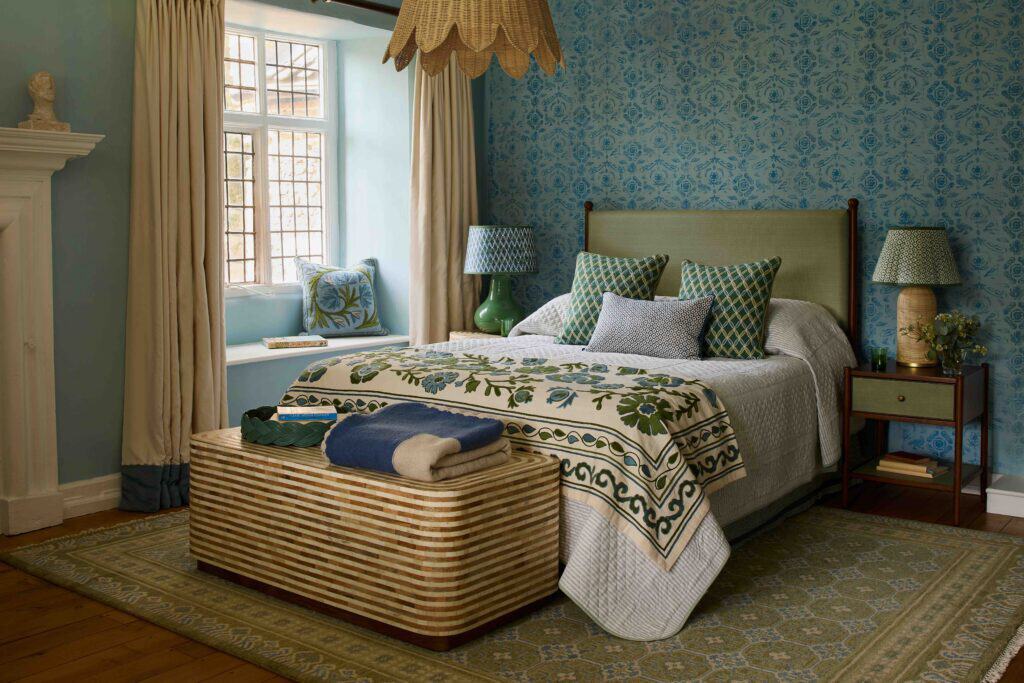
“When I select patterns for a residential project,
I will first look at the repeat size of the patterns,” says Xhensila Lala, marketing manager at William Morris Wallpaper Co. She groups patterns into small, medium and large repeats, making sure to incorporate at least two different scales. “The mixed patterns will have at least two different repeat sizes so that the eye has a place to rest,” Lala says. She recalls pairing two large-scale wallpaper patterns in one room, only to find the result “very unsettling, not layered.” Introducing a small geometric pattern alongside a large botanical print allowed both to stand out, Lala says.
Read The Room
The size of a room should dictate how many patterns you introduce — not whether you mix patterns at all, designers note. It’s just best to use a more restrained approach in smaller rooms, while larger spaces can comfortably accommodate several layered prints. “I typically recommend a dominant pattern and one supporting texture to maintain a 70/30 split for each of the patterns,” Lala says.
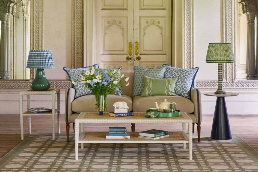
In the expansive spaces the Hamptons is known for, there’s enough visual space to incorporate three distinct patterns without overwhelming the eye, she adds. For example, “I would apply a large-repeat wallpaper to the focal wall, a medium-scale fabric to the seating and a smaller-textured fabric to the throw pillow,” she explains. “The three patterns will not compete for attention because they each will have room around them.”
Controlled Contrast
The difference between a richly layered room and one that feels visually overwhelming often comes down to restraint. Designers say the key is establishing a clear hierarchy so that every pattern has a purpose.
“Your hero is the largest, most important design, and it should be allowed to take center stage,” says Birdie Fortescue, British interior designer and founder of the homeware brand of the same name. “That hierarchy is what stops a mix of patterns from tipping into chaos,” Fortescue adds. “It gives the eye somewhere to land first.”
Creating breathing room is equally important. “Giving each pattern room to breathe by incorporating solid surfaces and negative space is just as important as the patterns themselves,” Slater explains. “When thoughtfully layered, patterns create depth, personality, and movement without sacrificing a sense of calm.”









![🎨 Through vibrant fabrics, layered textures, and intricate stitching, artist Nicole A. Vanasse transforms everyday moments into richly detailed works of art. Drawing inspiration from real life while inviting viewers to find their own meaning, her textile compositions celebrate memory, storytelling, and the beauty found in life's smallest details. Each piece is a reminder that art can be as much about the journey of creation as the finished work itself. [link in bio]](https://hamptonsrealestateshowcase.com/wp-content/uploads/sb-instagram-feed-images/763433386_18619953184030135_3337811349419388933_nfull.webp)