Farrow & Ball introduces 11 New Hues
You may already be familiar with the paint label Farrow & Ball, an English company that began in Dorset in 1946. Founders John Farrow and Richard Ball — a trained chemist and an engineer, respectively — met at a local clay pit, came together over a love of rich hues, and eventually sold their company, in the 1960s, to a man named Norman Chappell.
Since then, the label has continued to produce luxury paints, using original methods and recipes (no addition of plastics, for instance, and, as of 2010, an entirely new way of looking at paint, with a green-centric vision for the oil-based line, which are now produced in eco-friendly, water-based finishes). Farrow & Ball also produces wallpapers, and, as of 2012, the company runs an in-home color consultancy service, in which experts are available to curate tailored color palettes for individual interiors.
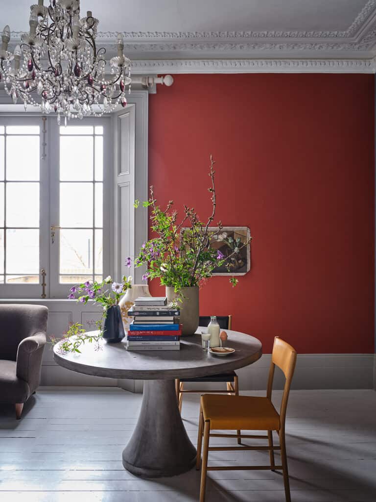
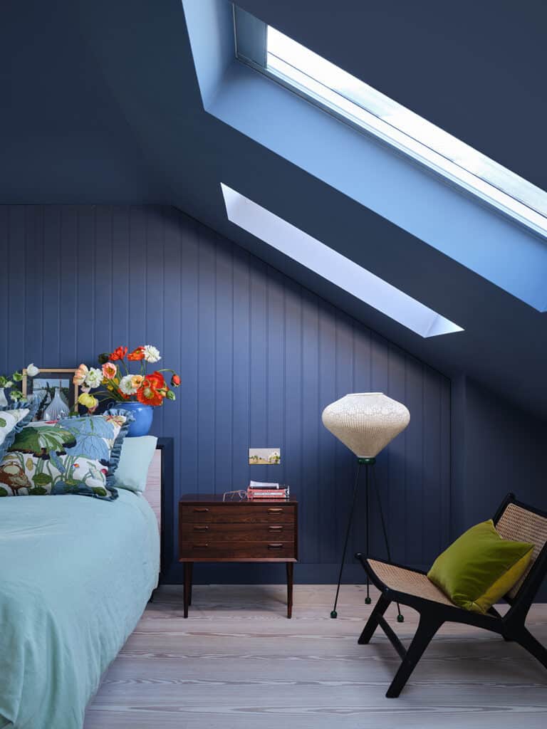
A Farrow & Ball home is a specific luxury home, to be clear, a home that is both upscale and understated, color-forward and reserved in ostentation. To see a room painted in Farrow & Ball is to recognize it immediately: the brand is defined by its moody blues and deep greens, its deeply saturated pigments that lend an air of sobriety to even the youngest and hippest of homes. The paint, in recent years, has taken off among the well-heeled; this is serious, luxury paint, for the connoisseur of design. And recently, they have added an astonishing 11 new hues to their line, colors that tend toward the playful and buzzy, yet another sign that the brand understands both the market and the current moment of design.
“Though, for now, it does feel right to stare out into an accent wall
that is not quite coral, not quite pink.“
A pink-hued Bamboozle is perhaps the most youthful of the new additions, although all of the brand’s new colors are embracing design’s current moment: color in appliances, accent walls, painted ceilings. If Farrow & Ball has always tended toward a deeper and more muted palette, this is their moment to embrace a different sensibility. Whirlybird, a mint green that recalls the refrigerators of the 1950s, feels right at home in today’s color-rich design sphere.
So does Tailor Tack, a blushing pink, not quite the millennial version, but rosy enough to soften a room.
Kittiwake blue is as bright as a robin’s egg, certainly one of the more daring colors of this group of 11. Farrow & Ball’s palette of 132 colors, it should be noted, is remaining at 132 — as a result, the brand has chosen to archive certain colors, including House White, Pale Hound, Churlish Green, Pavilion Blue, St Giles Blue, Mahogany, Salon Drab, and Savage Ground. Unlike other paint brands, which are readily expanding the color wheel, Farrow & Ball’s concept is finite, a palette that reflects the vicissitudes and moods only of the current moment.
Will Bamboozle fit our whims and whimsies in five or ten years? Who can really tell. Though, for now, it does feel right to stare out into an accent wall that is not quite coral, not quite pink. You can find Farrow & Ball’s paints at Aboff’s Paints and Wallcoverings in both Wainscott and Southampton.


![Festive flavors, candlelit corners, and winter menus worth the splurge 🍷 This season’s dining scene brings elegant French favorites, seasonal seafood, and cozy classics to the East End table. Whether it’s brunch, dinner, or something in between, these spots are celebrating the holidays in style. [link in bio]](https://hamptonsrealestateshowcase.com/wp-content/uploads/sb-instagram-feed-images/589526657_18551254843030135_4235854489711269175_nfull.webp)
![Space reservations are closing soon for the Holiday / New Year Issue of Hamptons Real Estate Showcase 🎁 This double issue comes with expanded reach, now landing in South Florida as well. Start the new year with premium visibility among luxury homeowners from the Hamptons to Miami. [link in bio]](https://hamptonsrealestateshowcase.com/wp-content/uploads/sb-instagram-feed-images/588642217_18550541596030135_1974828802096238970_nfull.webp)
![Holiday hosting is all about the details 🕯️ This season’s tabletops mix nostalgic charm with fresh touches. Think layered textures, seasonal greens, and flickering candlelight. Whether it’s a quiet dinner or a festive feast, there’s beauty in every setting. [link in bio]](https://hamptonsrealestateshowcase.com/wp-content/uploads/sb-instagram-feed-images/587562593_18550195297030135_5307983913708101790_nfull.webp)
![There’s no shortage of thoughtful, design-forward gifts to discover across the East End this season 🎁 Whether you're shopping for a hostess, a homebody, or someone who simply loves beautiful things, we’ve rounded up a few local finds that are sure to surprise and delight. [link in bio]](https://hamptonsrealestateshowcase.com/wp-content/uploads/sb-instagram-feed-images/587623967_18550040371030135_5392968951052147490_nfull.webp)