An East End cottage pays homage to its mid-century origins with of-the-moment flair
For about two years in the first half of the 1960s, Macy’s department store, in Manhattan, sold pre-fabricated cottages — called ‘Leisuramas’ — in Montauk. Designed by the architect Andrew Geller, these modest structures were conceived as vacation homes, as their name suggests. They came with all the signifiers of middle-class life in the Mad Men era: a cocktail table, a convertible sofa, even bath towels and toiletries — turn-key avant la lettre.
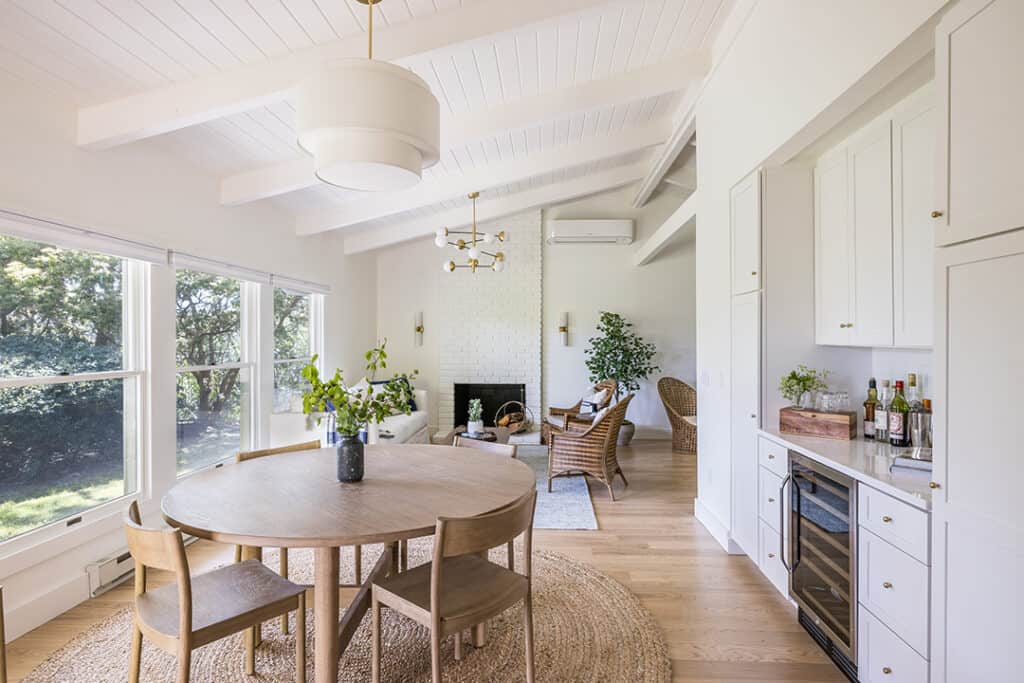
Steffen Ringelmann, an interior designer and furniture builder who runs studio MTK, has a longstanding love of mid-century architecture and design. So when the new owners of a Leisurama, a married couple with one child, engaged him to decorate the place, he envisioned a sleek yet historically correct re-do with furniture and fittings in rattan and brick and brass. The clients, however, had their hearts set on a “bright, light beach house,” albeit one with mid-century accents. For Ringelmann, the challenge was to fuse both styles in a way that seemed true to the 1,400 square-foot cottage’s origins and that also felt of-the-moment.
“I saw a lot of potential to lean into the architecture of the home and update it for contemporary living,” says Ringelmann, who was “very excited to work on a prototypical Leisurama.” But there were structural problems to be dealt with. “The place was in bad shape,” Ringelmann, who has extensive experience in the building trade, recalls. “The framing around the window openings was rotted and the kitchen cabinets were falling apart.” At first the clients had hoped to make only cosmetic changes, but once they started talking to Ringelmann and various contractors, they realized more intensive measures were in order.
They ended up stripping the house down to the studs, ripping away decades of fake wood paneling in the process. In its place went sheet rock and electrical wiring, plumbing, and insulation, all of it new. One big constraint was the lack of a crawl space, which made it difficult to move gas and plumbing lines, and limited what the homeowners could do. Happily, Ringelmann, who advised on the construction project, found a way to add an en suite bathroom, which the crew attached to the main bedroom. He also reconfigured an odd-shaped existing bathroom, thereby enlarging an adjoining closet.
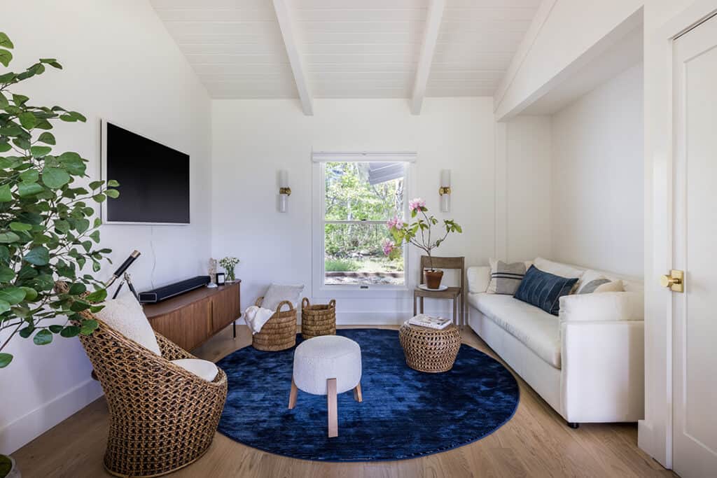
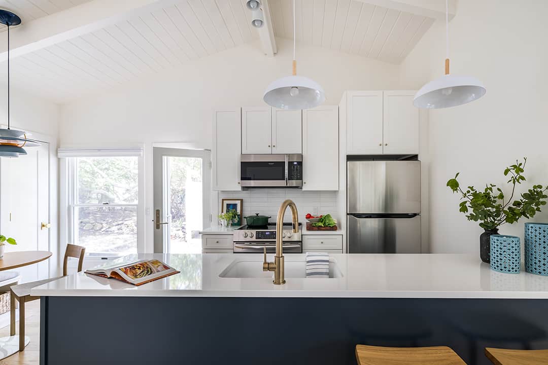
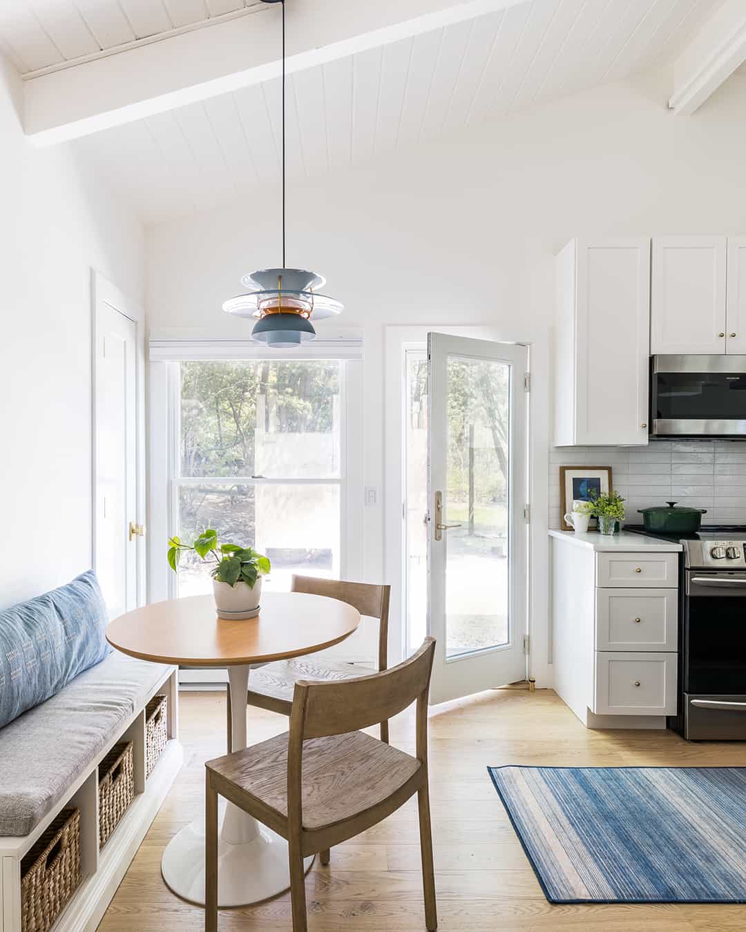
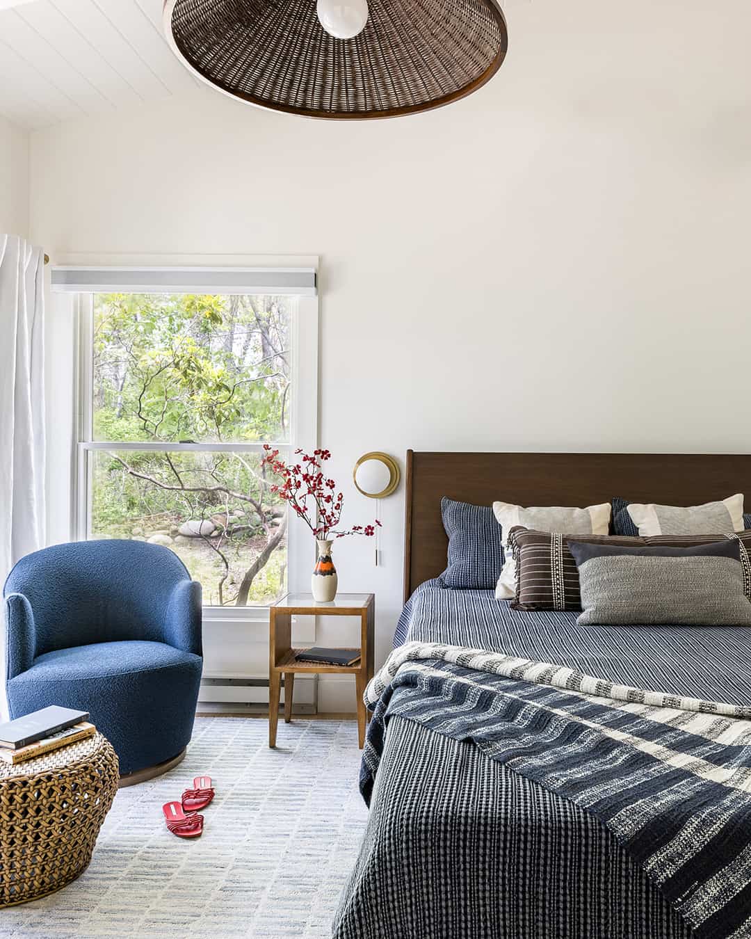
Once the infrastructure had been shored up, Ringelmann and the owners talked about how to achieve that elusive balance between mid-century style and latter-day beach house. “The way I saw it, we could go in one of two ways: either we leaned into the mid-century aspects, or we put more of an emphasis on coastal style. For instance, there was a wood-beamed ceiling, and we were divided as to whether or not to paint it white. Ultimately, we kept coming back to the clients’ vision and ended up painting the ceiling and walls in Benjamin Moore’s ‘Simply White.’ It’s a white that’s not too warm or too cool.” The neutral backdrop was offset with finishes and soft furnishings in blue hues.
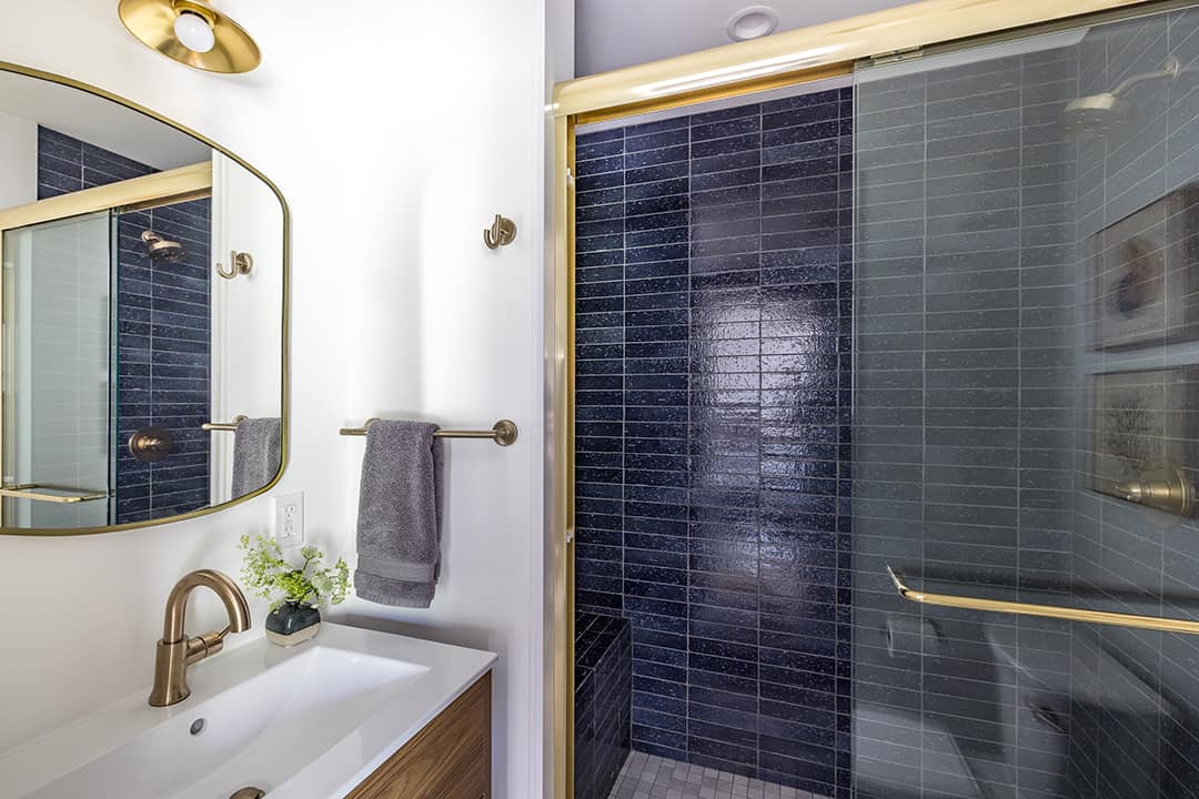
At the same time, Ringelmann found inventive ways to strike mid-century notes, whether by cladding the bathrooms and the kitchen and dry bar area in a subway tile that resembled brick — brick was used widely in mid-century homes — or using satin brass finishes throughout. “The clients loved that soft gentle aesthetic which works well with the blue and white color scheme.” The result is a house with a beachy mid-century aesthetic, mid-century French rattan light fixtures and all.
As for the unexpected gut renovation, Ringelmann says, “It was the right call. What you don’t want is a house that looks beautiful only to start to break down in five- or ten-years’ time. They now have a cottage that feels solid.”



![Join us May 6th at The Harmonie Club for the Spring Salon Luncheon, a beautiful gathering in support of a truly meaningful cause. Together, we’ll raise critical funds and awareness for @campgoodgriefeeh—@eastendhospice’s summer bereavement camp helping children and teens navigate loss with compassion, connection, and healing. [link in bio]](https://hamptonsrealestateshowcase.com/wp-content/uploads/sb-instagram-feed-images/491527001_18506092897030135_3117653411609489602_nfull.webp)
![Welcome to this exquisite custom-built home in the prestigious Quogue South estate section, just moments from Dune Road and some of the world’s most breathtaking ocean beaches. Completed in 2024, this expansive shingle-style residence offers 6 beds, 7 full and 2 half baths, a separate legal guest cottage, heated gunite saltwater pool with spa, all set on a beautifully manicured 0.74± acre lot. Represented by @lauren.b.ehlers of @brownharrisstevens. [link in bio]](https://hamptonsrealestateshowcase.com/wp-content/uploads/sb-instagram-feed-images/491516869_18505931593030135_4655757731678000577_nfull.webp)
![Discover 11 Oyster Shores, a unique marriage of thoughtful design, uncompromised execution and meticulous craftsmanship expressed across nearly 6,000± sq. ft. of highly curated living space. Brought to life under the watchful eye of Blake Watkins, the visionary behind WDD, the project is a refreshing departure from the ordinary. Represented by @nobleblack1 of @douglaselliman. [link in bio]](https://hamptonsrealestateshowcase.com/wp-content/uploads/sb-instagram-feed-images/491440257_18505740808030135_9064730571228880657_nfull.webp)
![Reserve your ad space now in the Memorial Day “Summer Kick-Off” Issue of #HRES! 🍋 Be seen by high-end buyers and sellers across the Hamptons, Manhattan, and South Florida—just in time for the start of the season. Secure your spot today and make waves this summer 🌊☀️ [link in bio]](https://hamptonsrealestateshowcase.com/wp-content/uploads/sb-instagram-feed-images/491441694_18505573426030135_4475989184561040528_nfull.webp)

![Tuesday, April 15, was Tax Day for most, but for someone in Palm Beach, it was closing day! The nearly 8,00± sq. ft. Mediterranean-style residence at 240 N Ocean Boulevard, with direct ocean views and a private, 100-foot beach parcel, closed at exactly $26,670,750. The seller was represented by Jack Rooney of @douglaselliman and Elizabeth DeWoody of @compass while Dana Koch of @thecorcorangroup brought the buyer. [link in bio]](https://hamptonsrealestateshowcase.com/wp-content/uploads/sb-instagram-feed-images/491445351_18505056166030135_4907944420436119099_nfull.webp)
![Previously featured on our 2024 Columbus Day issue cover, 74 Meeting House Road has officially sold! This stunning new construction in Westhampton Beach offers the perfect blend of thoughtful design and timeless style. Congratulations to @kimberlycammarata of @douglaselliman who held the listing! [link in bio]](https://hamptonsrealestateshowcase.com/wp-content/uploads/sb-instagram-feed-images/491441951_18504901357030135_2664904795600183799_nfull.webp)
![Located South of the highway in Southampton this 4 bedroom, 5.5 bath multi-story property, offers extensive exterior architectural detail throughout. 60 Middle Pond Road offers breathtaking views and tranquil living, nestled along the serene shores of Middle Pond and Shinnecock bay. Represented by @terrythompsonrealtor @douglaselliman. [link in bio]](https://hamptonsrealestateshowcase.com/wp-content/uploads/sb-instagram-feed-images/491451873_18504686110030135_5284427082339135969_nfull.webp)
